Seriously. Montreal and Vancouver's logos look so cheap and lame compared to ours.


Seriously. Montreal and Vancouver's logos look so cheap and lame compared to ours.
Toronto FC baby...best team everrrrrrrrrr -Jozy

Ya...why, in north america do they always have to incorporate an actual soccer ball into the logo?
I guess it's so people won't forget the sport...
Toronto FC baby...best team everrrrrrrrrr -Jozy

Do you think they would change the logo's if they step up to MLS??

well we are blessed with one of the most classic looking crests around.
I think that if they took the ball out of the Impact logo, and used a more traditional font
then it could look just as classic and traditional as ours. After all, it's designed on the Fleur-de-Lis
which is about as traditional as a symbol can get.
///\\\///\\\///\\\///\\\///\\\///\\\///\\\///\\\

Technically, there's a soccer ball in ours, buts it not completely noticable.
The only thing that bothers me about Montreal and Vancouver's logo's is they do that slanty thing that every logo created in NA since 1980 apparently has to do by law.Originally Posted by Pigfynn

As for the soccer balls thing...
I love our crest.
I hate how the circle BMO logo is the same size and directly below it on our kits, though. Makes them look really amateur.

I think Montreal at least could have done a lot better with their design. They already have the Fleur de Lis which would have been easy to incorporate into a classy shield. Ah well, maybe when the get into MLS they will modify it.

a football is not entirely a bad things. I believe Birmingham has the old-school sewn footballs on their logo, though I dislike the use of the more modern football in a logo. It's almost like its there for people to say "ohhh, a soccer team"
Logos become timeless and epic b/c of their authenticity and uniqueness. They stick out and become stuck in your mind:

I should have been more clear....cheesy 1970's black and white soccer ball...that makes them look like a rec soccer logo.
I think the football in the logo is fine but the crappy fonts and the way they try to make it look xtreme is just plain wrong.
Teams of all sports around North America have been going for the "xtreme" look over the past few years. It's freakin crap. NHL was really guilty of it though they are getting a little better. Most of the best logos and jerseys around the world belong to the oldest clubs. In hockey, just look at Detroit, NY, Chicago, Montreal, Toronto and Boston. Clean, bold, classy.
Anyways... back to soccer.
i concur:
now onto the greatest logo in all of Serie A LOL..and its for a firm!

well, its typical for north american sport teams to have that sort of logo. thankfully, TFC went for the traditionally coat of arms look of Europe.

That's coz we big time!

The worse for the MLS is definitely the Crew. Three douchebags wearing bowler hats trying to look intimidating/tough. Does Oddjob play for them? End rant here.
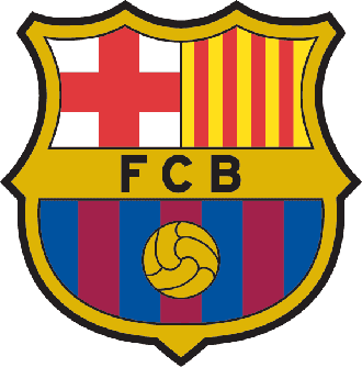
But in regards to Vancouver and Montreal, yes the soccer ball bothers me and makes it look cheap. Others brought up Barcelona and Manchester United as others who have a soccer ball, but if you notice, the difference is that it's not the "standard white with black octogons (or whatever shape it is)" ball. THAT is the part that looks cheap on the Montreal and Vancouver crests.
Last edited by Lucky Strike; 05-21-2008 at 11:38 AM.

I remember when I first saw the TFC logo on TV -- the first game of the first season, and Sportsnet's broadcast started and the TFC logo rolled onto the screen... took my breath away. Really classy.

Why do people even use the term "bush league" in the first place. It sounds as unoffensive as calling some1 a tool.

I don't mind Montreal's logo all that much. Definitely not as good or "classic" as ours. The Whitecaps logo is pure shite. When all is said and done,TFC has the best logo in the MLS followed by Chicago and DCU respectively. Chivas has a nice logo but it belongs to the original Chivas, so I refuse to include it. The Crew has by far the worse logo in the league. It might as well have been the logo for Chipendales or the Village People (GAY to say the least). KC's logo is pretty bad too. They didn't pay their design team for originality thats for sure...
I was at the logo unveiling ceremony down at the Ricoh Center. There was a big screen covering the logo (and name) and I had my fingers crossed that they wouldn't be calling us something stupid. The MLSE are the same people who called our team 'The Raptors' shorty after Jurrasic Park came out, so I was worried we were going to be call 'Toronto - Mission Impossible 3' or something equally stupid.
They dropped the banner overing the logo, and some tiny fireworks went off, and before me was the name TORONTO FC and the crest. I was immediately impressed, and confident that the team would be a success.
///\\\///\\\///\\\///\\\///\\\///\\\///\\\///\\\
I dunno, I might have ponied up for the Toronto Mighty Ducks......
Irony and a healhty sense of self-deprecation would have had to play a major role in my support, tho. Thank YOU, MLSE, for not going there
It's an expression.
I guess next time I should put:
Don't you think these cunts' logos look like a giant, open, pus-filled vagina sore?
Toronto FC baby...best team everrrrrrrrrr -Jozy
Yeah, not even Mission Impossible 2 - but MLSE didn't own the Raptors when they joined the league and got their name - remember John Bitove? And, I'm pretty sure they were going to name the team the Huskies but the NBA said the logo was too close to the Timberwolves.

i dont think their logos look bad...
they are a lower divison clubs

i really hate the sounders logo. and basically every usl logo. its so 70's (no offence, good music) and very basic. i think The mls logo needs a new one. i mean, how lamer can you get, with this. no ones gonna take us seriously !!

They are in the USL with a team called....
So WTF do you expect?

There's nothing wrong with the MLS logo....
look at your other friends to the south's logo...
Mexico's Premier League has a "Nothing says 80s like this" logo.
A league which is highly credible and taken very serious.
Last edited by footyfan; 05-21-2008 at 06:15 PM.
BTW MTL and VanCity's logo's are fine.
 Posting Permissions


 Reply With Quote


