^ We agree . . .Originally Posted by Red CB Toronto


^ We agree . . .

Red and whitenot a more generic football side colour combination in existence.
Really think we should lean away from the Canadian flag look, to a more stylish red & onyx; so unique and refreshing, for me.
Or vice versa.

Now it looks like a jersey. It's unfortunate that we need the advertising to think that but it just wraps it together.
Would still like there to be onyx piping on the sleeves and across the bottom that would look sharp.


If you like black I suppose. I've never liked black. Always associated it with funerals and people who try too hard.
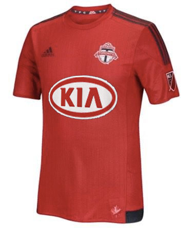
That being said, flame hawks mock ups make me more optimistic. Especially Kia

Portland is playing with a fugly upside down chevron and SKC is playing on graph paper. I'm happy with this.
In my mind, I would have always done it the same way you described. Having seen this design, I like that there are thicker patches that wrap around the sides, just slightly coming around toward the front/back. If it went all the way around, I feel like the straight line, being disturbed by natural motion, wouldn't look quite as sharp when worn (although, I'm not so sure about that; mainly just happy with this simple alternative to the generic idea of piping the sleeves and base of the jersey).
I can understand someone who doesn't know of colours mistaking it for black; I think, though, every time I've seen our away kits or had a look at our badge, etc., the onyx is very distinctly dark grey (even heard one commentator bizarrely refer to it as blue).
That said, I have no problem with a few hits of black.. but, have quite well embraced how the onyx compliments the red, and I'm glad it's not black.
You said, earlier, that the long sleeve might be better; this one has already grown on me, but I think you might be right about that.

post of the day winner.
Would be, if it were black; looks more like a few here are trying hard to make that a thing.
Look at yours vs. my avatar—both black?! Stop.
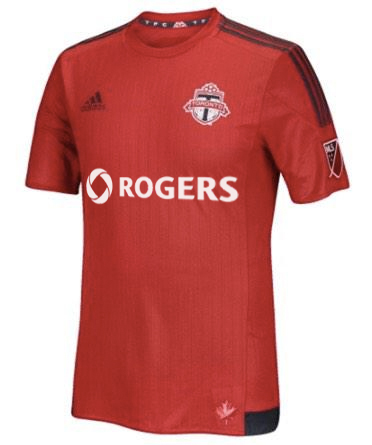
I wouldn't mind Air Canada as a sponsor. Their logo in white would look great on a red jersey. Found this random tshirt with a white logo:
We get a sponsor and a nice maple leaf that we always try to add to the jersey in one way or another. Unfortunately I haven't seen them sponsor anything soccer related.
Although it seems like they have in the past:
http://en.wikipedia.org/wiki/Canadia...%E2%80%9392%29
Not gonna get in a pissing match. It's a shade of black and no one cares about making that a thing. Black Onyx, whatever.
http://en.m.wikipedia.org/wiki/Shades_of_black
Conversations like these are why people hate forums.
Wow this looks great and that's their colours too! I think that would be great and this coming from someone who used to work for Bell. Vancouver vs Toronto Bell vs Rogers lol

I love it.
Great shade of red. Our alternate black jersey is "fancy" so it's good to have a basic primary.
Once we get a logo on there it'll start looking like a real jersey. Great mockups flamehawk.

Someone on reddit mocked it up with the Air Canada logo


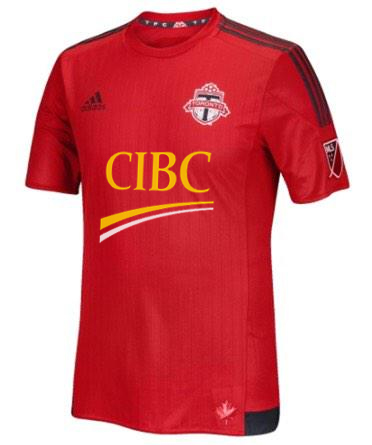
So apparently CIBC will be making an announcement about a sports affiliation within the next few months. It could not be TFC related but it could be. Who knows
CIBC do sponsor soccer in Canada (Main TV sponsor for FIFA events in Canada and PanAM soccer games). So I can see TFC being sponsor by CIBC.
EDIT: Interesting old article about CIBC and BMO battling over soccer in Canada (http://www.thestar.com/business/2010...supremacy.html)
Last edited by TFC07; 02-07-2015 at 04:31 PM.


I don't think we'll hear anything on jersey sponsorship until after the CBA is a done deal.I don't see any company committing to anything until then.

Looks like Bayerns new one
white sponser and our new home kit will look fantastic. I'm really into this kit, onyx and all

Looks great to me
yeah looks like training top to me. Cant say it does anything for me. Will still buy it. Sigh. Hope it looks better IRL

Here it is with CIBC:
Wouldn't it be nice if yellow was one of our official colours too. Don't see too many football teams with that colour combo, and I always liked how the Flames jerseys looked.
I don't mind the CIBC logo because it's a gold yellow not bright yellow. I like Rogers by far the most though.

I really like the CIBC one just for the fact that something on the kit grabs your attention. All of the other ones kind of fall into the background for me.

Like the CIBC one but can't see it while its still BMO field.
There's something a bit Manchester United about that shirt too.
Glad I got the deep red one.

CIBC I will never wear! Have very good reasons for this dating back years ago when they tried to screw me out of a few thousand dollars. I'll wear my old jerseys until they rot before I ever wear something with those bastards on it.

I hate to say it, but this looks pretty nice.

I like the new Columbus team logo, but aside from that, their shirts just make it look like they should be renamed the Barbasol Bananas.
Heroism breaks its heart, and idealism its back, on the intransigence of the credulous and the mediocre, manipulated by the cynical and the corrupt. ~Christopher Hitchens

Those mock ups look great. The jersey is starting to grow on me.
Bung?! People hate the forums because of a convo where someone is passionate about our colours, and sees some great potential, were they embraced?
Obviously, grey is a shade of black, just as orange is a mix of red and yellow.. yet I can't see any Houston fans too pleased about someone just choosing one of the colours to refer to them, nor if they were called reddish-yellow. Has nothing to do with a pissing match, and I even recognized where you were coming from, however still insistent that the difference is certainly there.
Anyway, man.. not to worry; won't trouble you on it anymore more, since it seems any challenge isn't particularly well received. o.0
You're righthadn't even thought of that, despite taking in some FCB matches, this year.
Really is quality, this one.
The more I look at it the more I seriously like the look of those CIBC jerseys
 Posting Permissions


 Reply With Quote