This will save me some cash.
I can take the crest off an old jersey, go to my local KIA dealship for a sponsor sticker to plop on my chest and then go to the Target liquidation sale and raid the 14.99 rack in the activewear section.
Gross.


This will save me some cash.
I can take the crest off an old jersey, go to my local KIA dealship for a sponsor sticker to plop on my chest and then go to the Target liquidation sale and raid the 14.99 rack in the activewear section.
Gross.

If that's the design, I can live with it. It's just the pendulum swing in designs to the simpler kits again. Remember kits in the 90s? Then they went simpler and lately they've gone back to more intricate designs. Now we'll probably see the simple ones for a few years, then back to the prints and fancy designs again. These cycles are just a bit more accelerated now because teams have a new kit every year or two.
Toronto FC baby...best team everrrrrrrrrr -Jozy

lol Amen.Originally Posted by Fort York Redcoat

** * **
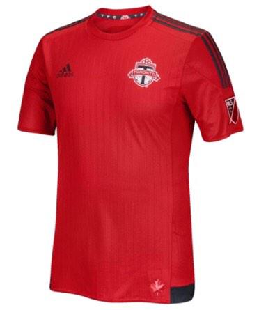
The newly leaked photo does the shirt a bit more justice; I can live with it, and agree that a sponsor and arm-patches will tie it all together, nicely.
Like kodiakTFC and I have talked about, elsewhere, a shift towards more red and onyx combinations is where it's atvery unique and classy looking, for me.
I only wish they would have put a trim of onyx along the end of each sleeve, but this isn't too bad.
What I like about simpler jerseys is you can easier wear them about, without looking like a crazy person. lol

you don't like the intricate jerseys?
God that kit is ugly, lol..

TFC tweeted out a pic of 4 of the players on the golf course. Hagglund is wearing that red shirt thing being called our new jersey.
No way they let him wear a jersey to the golf course.

I fucking lost it when I read this HAHAHAHAHA!!!

Looks like they are really playing up the "Reds" angle this year. Simplistic red jersey, #COYR hashtag used by the twitter account and Giovinco draped with "Come On You Reds" scarf (could this be the one we are getting?). Have to wonder if the marketing team drew inspiration from the jersey or perhaps vice versa.
So in that case, twitter leak jersey isn't official TFC jersey for this year. Good to know! I think that new jersey isn't coming out until shirt sponsor is announce.

But the one in that photo has a collar with the Adidas logo on it, so I don't think it's the same one. If anything, it does confirm that the design aesthetics of this year's clothing will include onyx stripes.

I believe the scarf Giovinco was wearing will be the season ticket holder Scarf. In a video I saw of his arrival at airport, when he was first given the scarf, someone says to him in Italian that this is the scarf given to the team's supporters.
RoadTrips:Columbus/Vancouver/Montreal/Columbus/NewYork/Montreal/
RPBScarf:2015/2019/2023

that is a training jersey

I think TFC might be going for the simple look this year.
Don't be shocked it the above is legit.
Any word on who the new jersey sponsor is going to be, or are they staying with BMO?

And a HUGE sponsor crest ?......but does seem Too good to be true , nice and clean .

^ Haha! You're right, that's exactly what's missing. Hopefully whatever logo we get on the front doesn't clash with the overall design.
Did the USA , of all countries, just fix soccer? - C. Ronaldo, May 27th commenting on the FBI-led investigations into fraud and corruption throughout FIFA.
Columbus' jersey just got leaked. Lends credence to our leak being the actual jersey, as Columbus' is also very minimalistic.


Actually I spot a faint checkered pattern which would match their crest. I expect ours to have some sort of pattern as well.

Aannnd it's pinstripes!

Its so plain but not in a good way. Training top is my first thought when seeing it.
I like it. Minimalist and clean.
White would've worked better than onyx for the flashes, though.
There better be a HUGE white sponsor logo on there. Long sleeve might look better than short.
also, the solid black band makes columbus' much nicer.
Last edited by Red4ever; 02-07-2015 at 01:03 PM.

Love this
Ewwwwwwwwwwwwwwwwwwwwwwwww.
Otherwise, agreed; the pinstripes at least give the design a bit more depth, and I still think an onyx trim along the end of each sleeve would have done a great deal of good (see Columbus's kit).
I think this will be the year I finally pick up a jersey, pending the sponsor isn't something ridiculous like "Bimbo."
Again, looking forward to being able to sport this casually about, without the overly sporty look of a busier design.
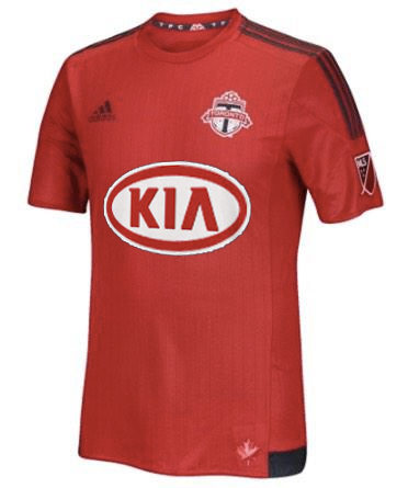
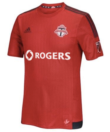
Could someone photoshop a big white Rogers logo onto the front of one of those to see how it would look? Maybe Kia as well?

I like the simple design, but at the end of the day all that matters is winning, so in mind they would wear anything.
Remember The Man, The Legend, The Goal 5-12-07 and All That #9 Left On The Pitch, Thanks For The Memories !!!
Based on how KIA appears on Bourdeux and Athletico jerseys.
I like simple designs but I don't really think this works. White instead of onyx would be much better. It will also depend if there is a sponsor on the shirt.
Rogers. Though if they were to sponsor, I'd think the logo would be bigger - don't know if they remove their circle logo and keep the text for example.
 Posting Permissions


 Reply With Quote