Tim Leiweke is going to hand sew every one of them so you know that they will be awesome!Originally Posted by barticusz


Tim Leiweke is going to hand sew every one of them so you know that they will be awesome!

Yeah, I like the Galaxy shirt as well. Not a big fan of the gradient in the diagonal stripes, but the overall look is nice.
Yeah, honestly I don't get why anyone would give that crest the green light. I sorta get the direction they were wanting to go with it, but it's far too dark, the soccer ball looks completely out of place (or more precisley, like it was just cut and glued into the middle), And the blue bars remind me of poor man's Kansas City logo.
Funnily enough, the minimalist home and away tops with ghost stripes look great - just not with the crest.
Did the USA , of all countries, just fix soccer? - C. Ronaldo, May 27th commenting on the FBI-led investigations into fraud and corruption throughout FIFA.
Rep'd for deprogramming technique.
Here's a link to a sneak peek at the new MLS 2014 Kits.
http://www.footyheadlines.com/2014/0...all-infos.html
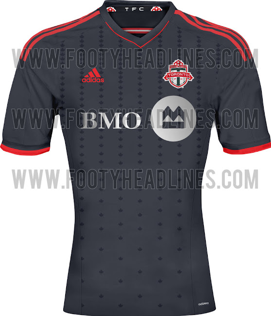
I find it interesting that they are saying Toronto's new secondary is black when it clear is not.

The dark onyx is darker these last couple of years. It borderlines on black, take a look at the T in the newest jersey and you can see the tone.
Road Trips: July 7 2007 Chicago, July 22nd 2007 Columbus, August 11 2007 NY, October 13 2007 LA, March 29 2008 Columbus, May 24th 2008 DC, May 26 2008 Montreal, June 28th 2008 NE, March 7-11-14 2009 Charleston, March 28 2009 Columbus, April 10 2010 New England, May 12 2010 Montreal, April 7 2012 Montreal, March 16 2013 Montreal , June 3 2014 Montreal, March 14 2015 Columbus
Twitter: @RPBPhil

After years of wearing my black GK Frei jersey I may just have to grab this new TFC away jersey. Always loved the black jerseys. Not sure why. I like the new GK kits they were wearing on media day too with the blue. I may just have to grab one of those too.
It looks like the Philadelphia Union's dark jersey might be a similar template to our away jerseys. Instead of the blue with yellow pin stripes we have onyx with red pin stripes.

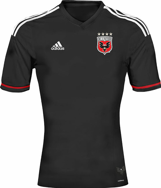
DC United released their new home kits yesterday to their fans.
We are proud to reveal our new kit for 2014. In keeping with Tradition, D.C. United's new jersey is mostly black, made of adidas' Adizero fabric technology. Our black kit might be the lightest in United's history, but still boasts "Tradition" on the back collar, keeping the Club's classic roots and values visible and clear. The secondary logo is seen on the red neck tape inside the collar, and the pattern of our eagle's wings is embossed in the adidas 3-stripe down the sleeve. Additionally, as teased via social media, the hip tag on the left side of the jersey is our all-black secondary logo.

Last edited by David_Oliveira; 02-16-2014 at 01:25 PM.
My Lord. That is freakin' beautiful.
Did the USA , of all countries, just fix soccer? - C. Ronaldo, May 27th commenting on the FBI-led investigations into fraud and corruption throughout FIFA.

I like the rebranding that San Jose did, but the hashtag on the back of the jersey is rediculous.
Do we really need to keep paying tribute to Canada with our club jersey?
From that article:
"Toronto FC 2014 Away Jersey is mainly black and pays tribute to Canada."

American teams have the american flag on the sleeve ? An American would never say what you've just said........Canadians are so curious.
ALL HELL'S BROKEN LOOSEhttp://gfycat.com/SharpKindArrowana
It's important to the TFC brand to do so.
We also compete every year against our rivals to be the best club in Canada. Should we qualify for the CCL, we are also representing Canada as much as ourselves. Just like in the ongoing Olympics, our country gets to put forth our best athletes in certain events. CCL is an international soccer tournament where our country gets to put it's best club in there. We very much represent Canada as a club.
I don't see what the fuss is all about for when we do this.

These new Adidas anthem jackets all the players are wearing at media day are awesome. Can't wait to get my hands on ours

Does anyone know what the 2014 TFC supporter's jersey will look like? Haven't seen anything online for it, but I know a new one is in the works.
Did the USA , of all countries, just fix soccer? - C. Ronaldo, May 27th commenting on the FBI-led investigations into fraud and corruption throughout FIFA.

http://www.mlssoccer.com/news/articl...inning-march-3
Our new kit is being unveiled on March 6th!

SO MUCH FOR JERSEY WEEK!!
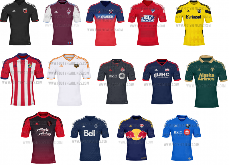
apparently these are a bunch of the upcoming shirts for the 2014 season

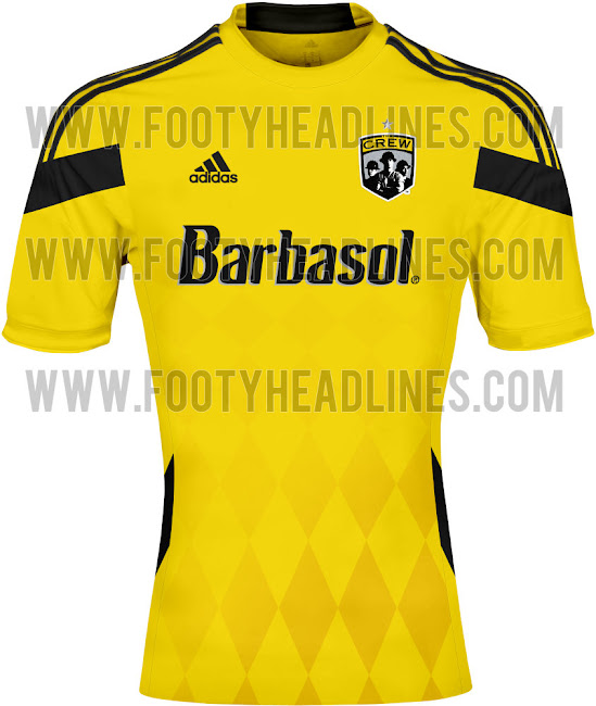
i don't understand why the columbus crew shirt has diamonds on it, at least do stripes and call it a throwback.
a trillium or steel design even. diamonds make no sense.
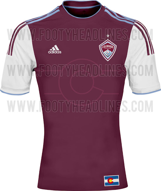
i actually love the rapids jersey with the C it's a nice mix of not being too flashy and have a little uniqueness to it. Really can't wait to see ours
Edit: Don't know if these have been posted but two more coming in Houston and Chivas

Last edited by Banjax; 02-22-2014 at 08:23 PM.
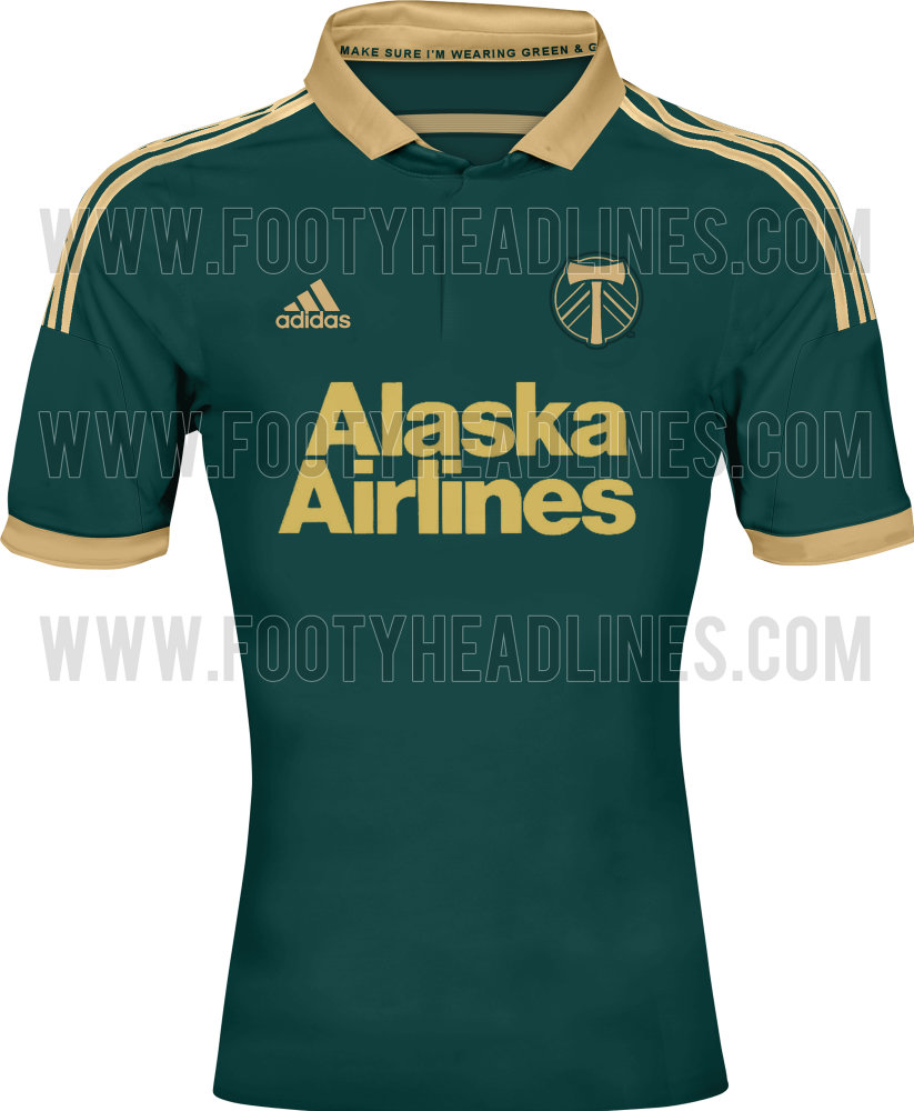
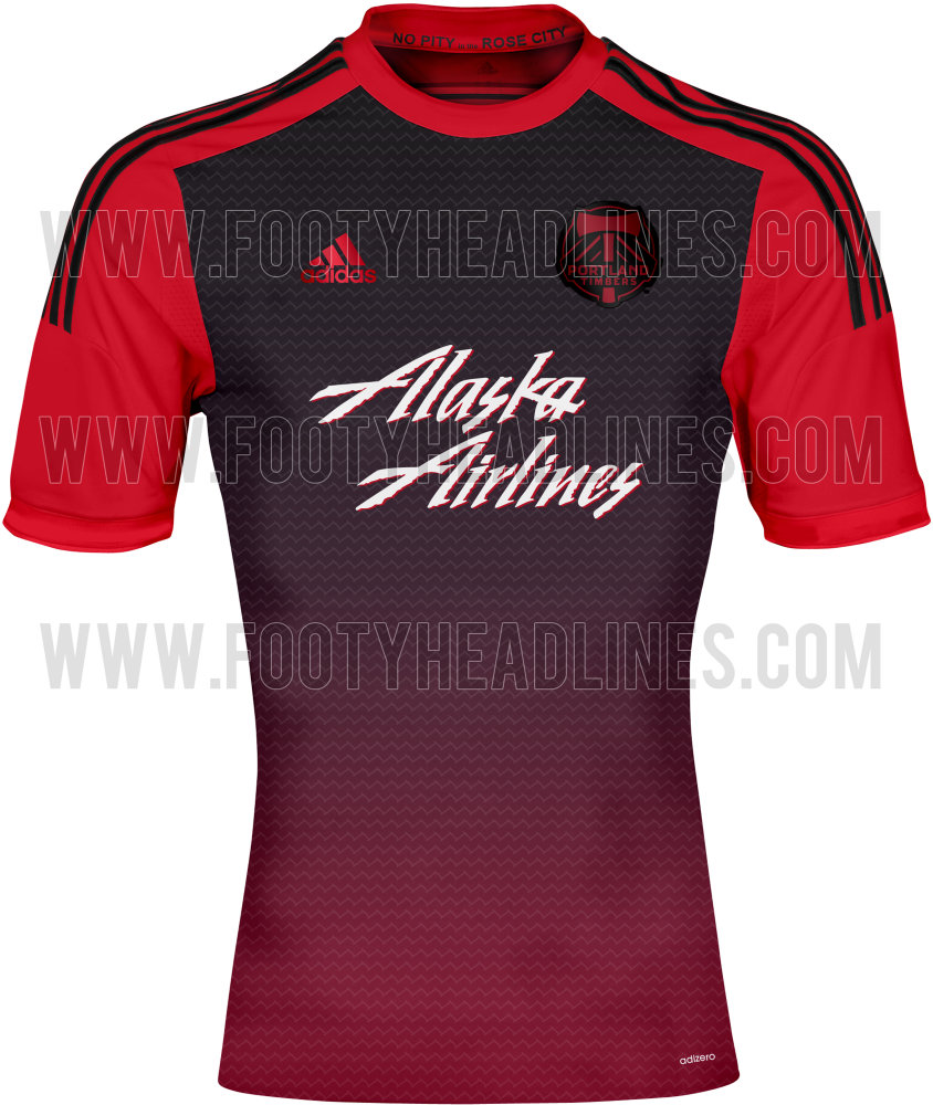
portland third and away


http://www.mlssoccer.com/news/articl...rtnership-leid
DC has a new sponsor, Leidos
Years have gone by and Ive finally learned to accept myself for who I am: a beggar for good football.
I go about the world, hand outstretched, and in the stadiums I plead: A pretty move, for the love of God.
And when good football happens, I give thanks for the miracle and I dont give a damn which team or country performs it.
-Eduardo Galeano
We've seen it before.
-N310_XL.jpg)

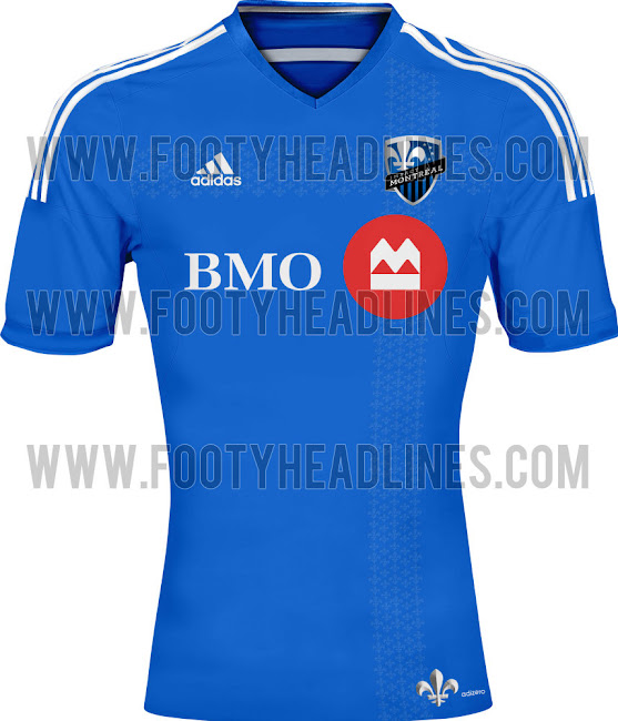
Montreal's home kit...
Note the fleur-de-lis in the same style as TFC's leaf.

Man Portlands Home Jersey (the green) is gorgeous and super retro looking!
You really outdid yourself, wowza! Man, I gotta admit, some of these shirt look really nice.
And it's interesting to point out that we've got some kits like DC United, Houston, or Chivas with a pretty minimalist design; and at the same time others like Columbus or Vancouver which are relatively complex.
The Good
Portland Home: Green and gold is such an effective combination here and the shirt just really stand out with a good contrast between the two colours. My only criticism is the use of the alternate crest.
Portland Away: I'm normally not a fan of gradients on uniforms, but the transition from red to black just works well here.
Houston: The addition of the light blue trim to the shirt and around the crest looks tight. Such a minor thing, but it makes a big difference, visually.
The Bad
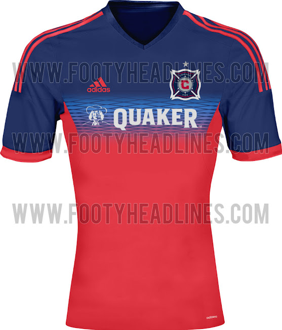
Chicago: The light blue band with pattern across the chest that separates the dark blue and red is just rubbish.
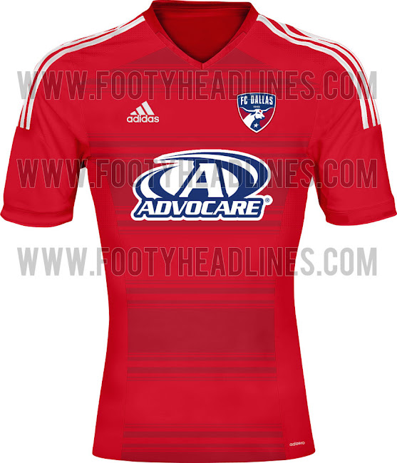
FC Dallas: Honestly, it looks like a busted TV screen with the "image-burn" horizontal stripes.
Columbus: Again with the gradients! Seriously, if your going to go with a diamond pattern, do it right and just go all-out with them. Contrasting light and dark yellow diamonds would have worked it they covered the entire torso. Here, it just looks like the designer got tired and called it a day when he was only half finished.
Did the USA , of all countries, just fix soccer? - C. Ronaldo, May 27th commenting on the FBI-led investigations into fraud and corruption throughout FIFA.

What's with the dimensions of those shirt pictures? Are corsets going to be part of the standard attire this season?
- Scott
Heroism breaks its heart, and idealism its back, on the intransigence of the credulous and the mediocre, manipulated by the cynical and the corrupt. ~Christopher Hitchens

What? Those shirts are ready for the club. Yeah...it's jersey time....
Trouble getting into your new kits?
We got you covered, man.
http://forums.redpatchboys.ca/showth...ght-loss-group
FORMER FULL TIME KOOL-AID DRINKER

For real. Same weight but have gone up to XL, can't squeeze into L anymore without causing discomfort and frightening onlookers.
 Posting Permissions


 Reply With Quote