(i felt like this was the proper place to put it).
Besides tfc, Past and Present, i like dc united's current one


(i felt like this was the proper place to put it).
Besides tfc, Past and Present, i like dc united's current one
I like this one for obvious reasons but I also like the TFC logo. Both are classy. Other than that Real Salt Lake's isn't bad either.Originally Posted by Angelo1405


I like the Galaxy logo, it's simple and clean.


Mine is our own, it has such a classic look to it.
Remember The Man, The Legend, The Goal 5-12-07 and All That #9 Left On The Pitch, Thanks For The Memories !!!
Its good but its essentially Guadlajara's.

Me too...Aside from TFC, that would be my choice.

lol but nobody beats the WIZ!!
honestly this has to be one of the worst... by far
Heheh - http://www.dailymotion.com/video/x2d...e-wiz-1988_ads
Agreed that it lacks originality...but it's still probably the best looking one for me.

looks like it should be on the front of a Dodge Pickup truck er sumthin
It will only be around for 2 years before the new stadium/rebranding.

This is my favourite MLS logo - the new United one.

sure it's not 'classic football' but it's a really well designed logo.

///\\\///\\\///\\\///\\\///\\\///\\\///\\\///\\\
why because it looks like your avatar
whoa..... I didn't even think of that. good catch!
///\\\///\\\///\\\///\\\///\\\///\\\///\\\///\\\
Ya FC Dallas is a great example an Americanized logo that still retains a traditional soccer look. They did an excellent job with that logo.
I also love Chicago's logo. Very unique and fits their team very well.
Teams like the Crew, Wiz and Revs still look awful though. They are dying for a redesign.
Edit: Chivas is great, but I dont really see it as an 'MLS' logo.
Last edited by ilikemusic; 05-22-2008 at 06:29 PM.

Parkdale: Is it chupacabra or chupathingy?
and I'd say our logo and the Chivas USA one.

My buddy asked if the DCU crest looked a bit too much like the nazi colours from a distance...
I agree with most comments here...DC, Chivas even Dallas having decent logos.
But my favourite is Toronto...when they revealed it...I was so relieved and happy that they had done an excellent job.
agreed... i thought so too. maybe it's the eagle.
Then again, doesn't everything from Washington involve some sort of hidden symbology

I'll give props to DC's logo. Its just really nice and clean as crests go. Real Salt Lake also works well for me. I'm no fan of the name, but the team's visual identity is top-knotch. Chicago Fire is up there too. I can't stand the logos from the Revs, the Crew, or Wizards. Those are nothing more than bush-league crests compared to the rest of the league.
Did the USA , of all countries, just fix soccer? - C. Ronaldo, May 27th commenting on the FBI-led investigations into fraud and corruption throughout FIFA.

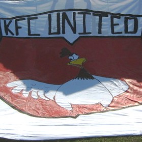
My favorite just based on the uproar it caused:


Animals Eaten:
pig, cow, lamb, moose, chicken, quail, kudu, ostrich, kangaroo, octopus, alligator, rabbit, shark, springbok, goat, bison, boar, caterpillars, turkey, fish, lobster, crab, oyster, prawn, antelope, camel, eel, squid
That name and logo had so much potential. Okay maybe not the name but the logo could have been more...well...regal. They really screwed up by having Barca colours with the Real name. That's just not kosher. It would be like having a team called the Rangers with Celtic colours and vice versa.

I swear they stole that from a steak-sause lable.
The St. Louis logo for the proposed team looks awesome.
Yeah. Now if they could have worked a pyramid and "all seeing eye" into it i'd be even better
Agreed. Even though I like ours, I'd be a little bit jealous if they get this:

 Posting Permissions


 Reply With Quote