this is great!Originally Posted by tcp-ip


this is great!

I do believe that will be our next logo. I think they will keep the ribbon and put "All for One" or maybe "Est: 2006" or perhaps use roman numerals (MMVI). Something along those lines. It wouldn't bother me that much. I do like our current logo, but the Academy crest is very sharp and very unique. Hopefully, any change will be many years down the line, though. I hate when clubs are constantly reworking their identity.
Did the USA , of all countries, just fix soccer? - C. Ronaldo, May 27th commenting on the FBI-led investigations into fraud and corruption throughout FIFA.

I would love to see that as our new logo! maybe it is just me but I would also love to have the dark grey with red accents as our home shirts instead of the red. IMO there are way too many clubs with red, it is nice to see something new and how many teams have the dark grey as their number 1 kit? not too many, it would be much more original.

The Academy Logo is definitely far better than our current logo. I hope the big club adopts it as a permanent badge.

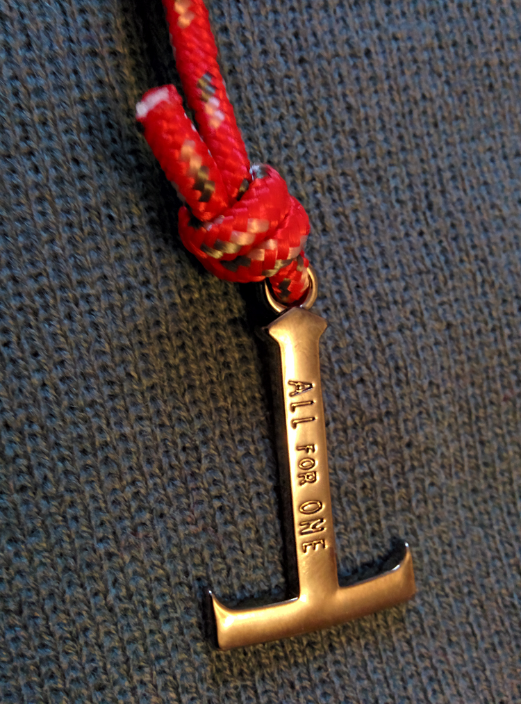
I am a fan on minimalism and would actually love if we got rid of everything on our badge except for the T. Sort of like the bracelet thing that came with the 2014 SSH package:
I think that would look very stylish on a shirt and be instantly recognizable.

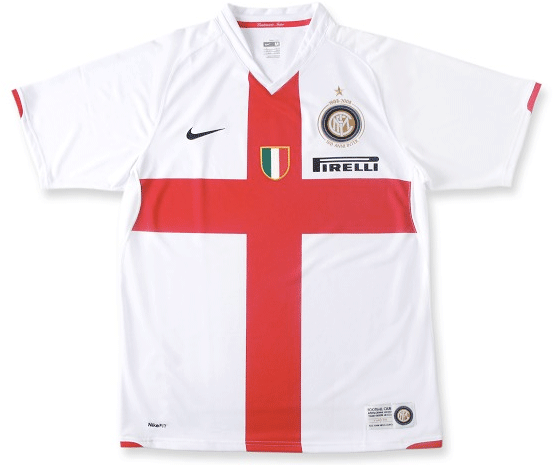
Actually that got me thinking that it would be neat to have the "T" incorporated into the jersey. I'm thinking of the St. George cross Inter jersey without the upper section:
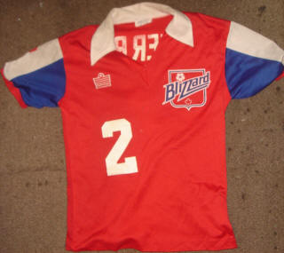
if we wore this with a TFC crest (in place of the Blizzard one), as a shout out to the blizzard.
I'd be into that.

This. I love this idea.

^ Not to sound blasphemous but I can just imagine all the shtick TFC would get for wearing USMNT-looking kits after recruiting two of their most recognizable names.
Something like maybe this unused alternate:
Or perhaps something even more minimalist like this:
I typically like the minimalist approach when it comes to kits and jerseys, but my preferences for crests vary. Some can be fairly complex but still effective in my mind. Others are incredible simple but are more powerful because of it. Out of all the current crests in use, it'd be hard for me to rank them, but LAFC, NYCFC, and Philly are toward the top of the list and that's a mixed bag of simplicity and complexity. Same goes for my bottom picks; RSL, NER, and CCSC.
Last edited by Cashcleaner; 01-21-2016 at 01:20 PM.
Did the USA , of all countries, just fix soccer? - C. Ronaldo, May 27th commenting on the FBI-led investigations into fraud and corruption throughout FIFA.

I wouldn't mind blue if it was based on some design from the Toronto flag.

looks like jersey roll outs will be mid february
NER announced theirs for feb11
yes, exactly.
Portlands 70s homage is very popular with their fans ... and their started wearing them almost every game down the stretch this season.
colorado did this, based on the state flag ... and its terrible - worst second kits in the league by a longshot. its so different from their traditional villa/WHU knockoff colours

NYCFC away kit leaked.. looks to be photoshop image though
Last edited by djcuse; 01-21-2016 at 06:04 PM.
I'm glad I'm not the only one who thinks they should switch to the TFCA logo. You talk to some people and it's like the idea of changing a nine year old logo is sacrilege.
The current logo isn't exactly bad. If not for the TFCA logo thought of changing it probably wouldn't cross my mind. But that TFCA logo is just so sexy and it's a bit odd that our academy has a better logo than the first team.
I like the idea of putting All For One on the banner. It turns it from a marketing slogan into a club motto.

Last edited by freshfreshfresh; 01-24-2016 at 07:24 AM.

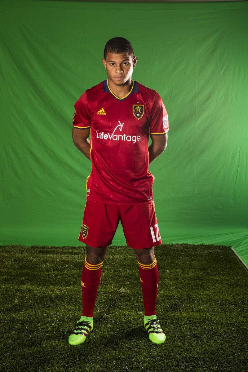
Think RSL are the first to officially unveil theirs, did so Friday night.
I LOVE it! it is kind of an old school look.
if Manchester City can change their logo, what is the big deal if we change ours?


Hmmm...stripes on the sides not on the shoulders through the shorts, pinstripes and a fake collar look.

The stripes on the side is the new Adidas template.


Not a fan of this, really ugly

The zip up Seba wears in the pic of him and Kaka has the stripes on the side so it's likely that's what we'll end up with.
That works out well to with the motto as well.
Did the USA , of all countries, just fix soccer? - C. Ronaldo, May 27th commenting on the FBI-led investigations into fraud and corruption throughout FIFA.
Adidas released their templates for 2016/17 jersey. Might TFC away kit come from one of these designs?
Based on the RSL Jersey I can see the new TFC away kit using the Adidas Condivo design with the main color being the onyx black. Would look alright I think!
http://www.footyheadlines.com/2015/0...-kits.html?m=1
Last edited by djcuse; 01-24-2016 at 02:52 PM.
I love the Academy logo.
I thought there was something about the Team wanting to Distance itself from the logo for some reason.
does anyone remember this?
Because neither the words "football" nor "club' are in the full name for our senior team. The "fc" in our name technically doesn't stand for anything.

I think that changed because TFC now use football club at times. Recently the tfc website had the words Toronto Football Club as its wallpaper.
Check out this tweet at https://twitter.com/TotalMLS/status/691647407071727616
yikes.
Are all MLS kits going to adopt the new Adidas design or will some still feature the striping on the shoulders?
I'm not a fan of the new look.
 Posting Permissions


 Reply With Quote