Page 8 of 27 FirstFirst ... 45678910111218 ... LastLast
Results 211 to 240 of 787
  1. #211
    Registered User
    Join Date
    Jan 2014
    Posts
    3,073
    Mentioned
    0 Post(s)
    Tagged
    0 Thread(s)

    Default

    A visual abomination only worthy of the people and city of Columbus, Ohio. Well done Precourt, you magnificent son of a bitch.
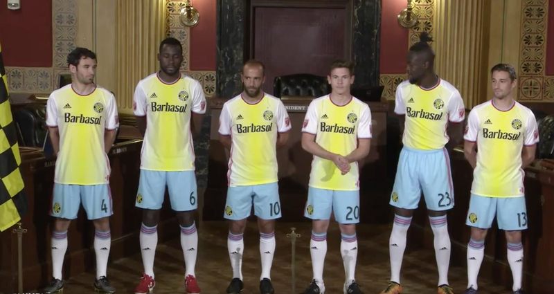
  2. #212
    Registered User
    Join Date
    Dec 2015
    Location
    sec 107
    Posts
    491
    Mentioned
    0 Post(s)
    Tagged
    0 Thread(s)

    Default

    Quote Originally Posted by nfitz View Post
    Just googled it. Laughing at Columbus. The players look embarrassed! There's a chant in here somewhere ...

    worst kits in the history of the game.

    .. can't believe these guys have to wear them. Those guys don't look to happy.

    is this their primary kit?

  3. #213
    Registered User
    Join Date
    Apr 2013
    Location
    Calgary, AB
    Posts
    240
    Mentioned
    0 Post(s)
    Tagged
    0 Thread(s)

    Default

    It looks like they are wearing shorts from a different kit. Hell, a different team.

  4. #214
    Registered User
    Join Date
    Jan 2016
    Location
    North York, ON
    Posts
    50
    Mentioned
    0 Post(s)
    Tagged
    0 Thread(s)

    Default

    WTF! Those are brutal. why the blue shorts? it looks like it is totally out of place. at least ours can't be worse than that.

  5. #215
    Registered User
    Join Date
    May 2008
    Location
    Section 119
    Posts
    11,698
    Mentioned
    0 Post(s)
    Tagged
    0 Thread(s)

    Default

    LOL.

  6. #216
    Registered User
    Join Date
    Jan 2013
    Location
    Stoney Creek
    Posts
    2,856
    Mentioned
    1 Post(s)
    Tagged
    0 Thread(s)

    Default

    LOL at Kamara tucking his shirt in to put a cherry on top of this whole thing.

  7. #217
    Registered User
    Join Date
    Jan 2016
    Posts
    353
    Mentioned
    0 Post(s)
    Tagged
    0 Thread(s)

    Default

    We all laugh at the yellow football team

    The yellow football team

    The yellow football team!

  8. #218
    Registered User
    Join Date
    Mar 2009
    Location
    Bloor West Village
    Posts
    1,312
    Mentioned
    1 Post(s)
    Tagged
    0 Thread(s)

    Default

    Quote Originally Posted by nfitz View Post
    Just googled it. Laughing at Columbus. The players look embarrassed! There's a chant in here somewhere ...


  9. #219
    Registered User
    Join Date
    May 2008
    Posts
    923
    Mentioned
    0 Post(s)
    Tagged
    0 Thread(s)

    Default

    Wow...

    just....wow.

    Horrible kit! That is one of the most awkward looking pictures I have seen come out of MLS in a long time.

  10. #220
    Registered User
    Join Date
    May 2008
    Location
    225 (sometimes)
    Posts
    1,064
    Mentioned
    0 Post(s)
    Tagged
    0 Thread(s)

    Default

    hahaha. how does that even happen?

  11. #221
    Registered User
    Join Date
    May 2008
    Posts
    325
    Mentioned
    0 Post(s)
    Tagged
    0 Thread(s)

    Default

    Quote Originally Posted by Deltron View Post
    WTF! Those are brutal. why the blue shorts? it looks like it is totally out of place. at least ours can't be worse than that.
    The colours for the kit come from Columbus' municipal flag:


  12. #222
    Registered User
    Join Date
    Dec 2015
    Location
    sask
    Posts
    43
    Mentioned
    0 Post(s)
    Tagged
    0 Thread(s)

    Default

    Quote Originally Posted by Enterprise Captain View Post
    The colours for the kit come from Columbus' municipal flag:

    That doesn't make it right.

  13. #223
    Registered User
    Join Date
    May 2008
    Posts
    325
    Mentioned
    0 Post(s)
    Tagged
    0 Thread(s)

    Default

    Quote Originally Posted by the beat View Post
    That doesn't make it right.
    There is no right or wrong here. I answered a question. The colours for the kit weren't chosen at random. Whether you like the kit or not is totally subjective. Personally, I find it hideous.
    Last edited by Enterprise Captain; 02-11-2016 at 08:46 AM.

  14. #224
    Registered User
    Join Date
    May 2008
    Location
    Brampton
    Posts
    447
    Mentioned
    0 Post(s)
    Tagged
    0 Thread(s)

    Default

    Congrats Shitlumbus, you just peed all over yourself

  15. #225
    Registered User
    Join Date
    Jan 2014
    Posts
    3,073
    Mentioned
    0 Post(s)
    Tagged
    0 Thread(s)

    Default

    Why is there a big boat on their city flag? Columbus is landlocked.

  16. #226
    Registered User
    Join Date
    May 2008
    Location
    Detroit, Michigan
    Posts
    5,380
    Mentioned
    0 Post(s)
    Tagged
    0 Thread(s)

    Default

    If that was an all white kit, with red collar, yellow adidas stripes on the shirt and sky blue stripes on the shorts and socks, that would have been good enough. Streaky yellow? Someone's just having a laugh with that.

  17. #227
    Registered User
    Join Date
    Dec 2015
    Location
    sask
    Posts
    43
    Mentioned
    0 Post(s)
    Tagged
    0 Thread(s)

    Default

    Quote Originally Posted by Enterprise Captain View Post
    There is no right or wrong here. I answered a question. The colours for the kit weren't chosen at random. Whether you like the kit or not is totally subjective. Personally, I find it hideous.
    Defensive much? I was just echoing everyone's sentiment that it's ugly as fuck, no matter where they got the colour scheme from.

  18. #228
    Registered User
    Join Date
    May 2008
    Posts
    2,756
    Mentioned
    0 Post(s)
    Tagged
    0 Thread(s)

    Default

    Quote Originally Posted by molenshtain View Post
    Why is there a big boat on their city flag? Columbus is landlocked.
    Well given that the city is named after Christopher Columbus and there appears to be a cross of St. James on the sail I'd imagine it's depicting the Santa Maria, or another of Columbus's ships.

  19. #229
    Registered User
    Join Date
    May 2008
    Posts
    226
    Mentioned
    0 Post(s)
    Tagged
    0 Thread(s)

    Default

    Quote Originally Posted by molenshtain View Post
    Why is there a big boat on their city flag? Columbus is landlocked.
    I would assume because of Christopher Columbus?

  20. #230
    RPB Member
    Past-President

    Join Date
    May 2008
    Location
    112 - RPB
    Posts
    12,909
    Mentioned
    3 Post(s)
    Tagged
    0 Thread(s)

    Default

    What a terrible kit Columbus have. I pray ours isn't anywhere close to that train wreck.
    Road Trips: July 7 2007 Chicago, July 22nd 2007 Columbus, August 11 2007 NY, October 13 2007 LA, March 29 2008 Columbus, May 24th 2008 DC, May 26 2008 Montreal, June 28th 2008 NE, March 7-11-14 2009 Charleston, March 28 2009 Columbus, April 10 2010 New England, May 12 2010 Montreal, April 7 2012 Montreal, March 16 2013 Montreal , June 3 2014 Montreal, March 14 2015 Columbus

    Twitter: @RPBPhil

  21. #231
    Registered User
    Join Date
    Apr 2015
    Location
    114
    Posts
    985
    Mentioned
    0 Post(s)
    Tagged
    0 Thread(s)

    Default

    Quote Originally Posted by Phil View Post
    What a terrible kit Columbus have. I pray ours isn't anywhere close to that train wreck.
    Same here. They made theirs after their state flag. I like the Ontario flag but I don't see it looking good on a jersey so hopefully they take a different path for selecting the design.

    There are some rumors that our kit will have blue and the flag of Ontario has some blue... so fingers crossed on that one

  22. #232
    Registered User
    Join Date
    May 2008
    Posts
    226
    Mentioned
    0 Post(s)
    Tagged
    0 Thread(s)

    Default

    Quote Originally Posted by Mateo1985 View Post
    Same here. They made theirs after their state flag. I like the Ontario flag but I don't see it looking good on a jersey so hopefully they take a different path for selecting the design.

    There are some rumors that our kit will have blue and the flag of Ontario has some blue... so fingers crossed on that one
    It's the Columbus city flag, not Ohio's. If the rumours of blue in our kits are true it is likely based on the Toronto city flag, not Ontario's.

  23. #233
    Registered User
    Join Date
    Aug 2010
    Posts
    949
    Mentioned
    0 Post(s)
    Tagged
    0 Thread(s)

    Default

    A good friend of mine is at the TFC media day today, and has confirmed that the new away kit is indeed a white shirt with red shorts

  24. #234
    Registered User
    Join Date
    Apr 2015
    Location
    114
    Posts
    985
    Mentioned
    0 Post(s)
    Tagged
    0 Thread(s)

    Default

    oh that's not bad at all then. Absolutely love the Toronto's flag. The captain band is just awesome.

  25. #235
    Registered User
    Join Date
    Nov 2012
    Posts
    97
    Mentioned
    0 Post(s)
    Tagged
    0 Thread(s)

    Default

    They also put the city's seal on the inside of the crew kits.


    Can't imagine that would be comfortable over the course of a match.

  26. #236
    RPB Member XI17 Moderator
    Join Date
    May 2008
    Location
    Oshawa, Ontario
    Posts
    8,510
    Mentioned
    0 Post(s)
    Tagged
    0 Thread(s)

    Default

    Quote Originally Posted by nfitz View Post
    Just googled it. Laughing at Columbus. The players look embarrassed! There's a chant in here somewhere ...


    Seriously, anti-Columbus bias aside, that has got to be the worst looking kit I've seen worn by anyone at anytime. Gah! A vertical yellow-white gradient?! It actually looks like someone pissed down the front of their shirts. And the red trim does NOT help matters either. And to top it off, they have powder blue shorts? Nothing here looks good. Nothing can be redeemed. I am shocked that this kit was given the go-ahead by the club's brass.

    The kicker is that Columbus actually has a pretty good colour combination (Black, White, and Yellow) with which to work with and I've seen plenty of great shirt designs using those colours.
    Did the USA , of all countries, just fix soccer? - C. Ronaldo, May 27th commenting on the FBI-led investigations into fraud and corruption throughout FIFA.

  27. #237
    Registered User
    Join Date
    Nov 2011
    Location
    112
    Posts
    223
    Mentioned
    1 Post(s)
    Tagged
    0 Thread(s)

    Default

    Columbus Piss-Stains SC. What a hideous jersey. Looks like the marketing team gave their kids a set of highlighters and a white jersey and let them have at it lol

  28. #238
    Registered User
    Join Date
    May 2008
    Location
    Brampton
    Posts
    447
    Mentioned
    0 Post(s)
    Tagged
    0 Thread(s)

    Default

    Cryptic tweet from Kurt Larson concerning TFC away jersey...

    @KurtLarson...Coming shortly. All speculation. Kits more or less being released by the league.

  29. #239
    Registered User
    Join Date
    Jul 2008
    Posts
    1,549
    Mentioned
    0 Post(s)
    Tagged
    0 Thread(s)

    Default

    Quote Originally Posted by CBTFC View Post
    A good friend of mine is at the TFC media day today, and has confirmed that the new away kit is indeed a white shirt with red shorts

    I am tad worried that it will end up looking a lot like NYRB's. I hope they still incorporate onyx and grey a little. I am a weird one that actually liked our first couple grey away jerseys - thought it was pretty distinctive in the footballing world.

  30. #240
    Registered User
    Join Date
    Feb 2015
    Location
    Section 111 Row 26
    Posts
    47
    Mentioned
    0 Post(s)
    Tagged
    0 Thread(s)

    Default

    Just saw this jersey, if Nike made the jersey's for MLS! This one I think looks slick (looks close to the same style of jersey they were wearing in Pre-Season Games)


Posting Permissions

  • You may not post new threads
  • You may not post replies
  • You may not post attachments
  • You may not edit your posts
  •