Page 6 of 27 FirstFirst ... 234567891016 ... LastLast
Results 151 to 180 of 787
  1. #151
    Registered User
    Join Date
    Jan 2012
    Location
    Toronto
    Posts
    518
    Mentioned
    0 Post(s)
    Tagged
    0 Thread(s)

    Default

    Quote Originally Posted by tcp-ip View Post
    I have heard that we might be going back to the white kit but also heard that a new color may be introduced. Now not sure if the color will feature in the white jersey, or if it will be the whole jersey.

    I am not overly happy about the new color choice (given this years circumstances with sharing of BMO field). The color is featured in the Season 10 logos, leading me to believe that this rumor has some weight to it.
    So obviously it's blue. The tie in to the Toronto flag is nice but the association to the Argos and the impact is a little rough.

    Could be cool so we'll see.

  2. #152
    Registered User
    Join Date
    May 2008
    Posts
    226
    Mentioned
    0 Post(s)
    Tagged
    0 Thread(s)

    Default

    God I really hope it's not blue. There's enough reds and blues in the league already, we'd basically have the most boring colour schemes in the league, nevermind the associations with the argos/impact/caps.

    White, red and blue all together is not a bad look but it would be too similar to USA/Revs colours. Imo, either keep it simple with white/onyx/red or go experimental with yellow/red, teal/white, etc. (basically copy Liverpool lol)

  3. #153
    RPB Member
    Join Date
    May 2008
    Location
    Sec 117 row 12 seats 27 & 28
    Posts
    1,577
    Mentioned
    0 Post(s)
    Tagged
    0 Thread(s)

    Default

    I wish we did what Portsmouth is doing this year. They are letting fans pick their kits for next year. They gave the fans a choice of three for each their home, away, and 3rd kit and they got to choose.
    http://www.portsmouthfc.co.uk/news/a...s-2802442.aspx

  4. #154
    Registered User
    Join Date
    Jan 2014
    Posts
    3,073
    Mentioned
    0 Post(s)
    Tagged
    0 Thread(s)

    Default

    Portsmout is owned by their fans, so either way they'd be picking the jersey.

  5. #155
    RPB Member
    Join Date
    Nov 2008
    Location
    Toronto
    Posts
    1,080
    Mentioned
    0 Post(s)
    Tagged
    0 Thread(s)

    Default

    TFC sort of tried that a few years ago, the White and Red 2nd kit. It was "designed by" and "voted by" fans.

  6. #156
    Registered User
    Join Date
    Dec 2015
    Location
    sec 107
    Posts
    491
    Mentioned
    0 Post(s)
    Tagged
    0 Thread(s)

    Default

    they have gone to a monocromatic grey logo on the website.
    could it be white with onyx and grey. onyx and grey logo. SKC had something like this last season.
    Last edited by Onyx; 02-02-2016 at 05:02 PM.

  7. #157
    RPB Member
    Join Date
    Nov 2008
    Location
    Toronto
    Posts
    1,080
    Mentioned
    0 Post(s)
    Tagged
    0 Thread(s)

    Default

    Quote Originally Posted by Onyx View Post
    they have gone to a monocromatic grey logo on the website.
    could it be white with onyx and grey. onyx and grey logo. SKC had something like this last season.
    I see they have a new training top that is light grey with onyx stripes, as well as long sleeve sweater (Light grey with onyx stripes). Shorts looks to be oynx with light grey.
    Maybe my source mistook the light grey as white?
    But I was also told Blue would be featured is some way. Unless Blue will be a 3rd jersey?
    We will have to wait and see.

  8. #158
    RPB Member
    Join Date
    Nov 2008
    Location
    Toronto
    Posts
    1,080
    Mentioned
    0 Post(s)
    Tagged
    0 Thread(s)

    Default


  9. #159
    Registered User
    Join Date
    Jun 2014
    Posts
    4,770
    Mentioned
    0 Post(s)
    Tagged
    0 Thread(s)

    Default

    Quote Originally Posted by tcp-ip View Post
    I see they have a new training top that is light grey with onyx stripes, as well as long sleeve sweater (Light grey with onyx stripes). Shorts looks to be oynx with light grey.
    Maybe my source mistook the light grey as white?
    But I was also told Blue would be featured is some way. Unless Blue will be a 3rd jersey?
    We will have to wait and see.
    we had those training strips last year

  10. #160
    Registered User
    Join Date
    Apr 2010
    Posts
    439
    Mentioned
    0 Post(s)
    Tagged
    0 Thread(s)

    Default

    Anyone else noticing the pattern with the release of the new jerseys? One day a mock up is leaked and the next day they officially release the jersey. Then a day or two later the next jersey is leaked. A couple days ago it was Vancouver. Today it's Phili. I figure Toronto's will get "leaked" when the team gets back from California. This way the team will be conveniently home to officially release the jersey.

  11. #161
    Registered User
    Join Date
    Apr 2010
    Posts
    439
    Mentioned
    0 Post(s)
    Tagged
    0 Thread(s)

    Default


    Mock up found on www.footyheadlines.com Cleary not real but something similar with a T could work for next year's home jersey.

  12. #162
    Registered User
    Join Date
    May 2008
    Posts
    226
    Mentioned
    0 Post(s)
    Tagged
    0 Thread(s)

    Default

    Quote Originally Posted by Captain View Post
    Anyone else noticing the pattern with the release of the new jerseys? One day a mock up is leaked and the next day they officially release the jersey. Then a day or two later the next jersey is leaked. A couple days ago it was Vancouver. Today it's Phili. I figure Toronto's will get "leaked" when the team gets back from California. This way the team will be conveniently home to officially release the jersey.
    My guess is the leak/release is being held up by our lack of sponsor. Nobody wants to order a shirt without seeing what the sponsor on it is going to be and sponsors probably want their logo on there for the big release.

    Quote Originally Posted by Captain View Post

    Mock up found on www.footyheadlines.com Cleary not real but something similar with a T could work for next year's home jersey.
    A giant T like that is super fugly imo. If they're going to incorporate one, it should be subtle and/or small, not a huge treasure trail/arrow to the peen.

  13. #163
    RPB Member
    Join Date
    Apr 2012
    Location
    116
    Posts
    21,831
    Mentioned
    0 Post(s)
    Tagged
    0 Thread(s)

    Default

    Whoever did that mockup is clueless about how things look when worn on a human body.

  14. #164
    Registered User
    Join Date
    Apr 2011
    Posts
    2,138
    Mentioned
    0 Post(s)
    Tagged
    0 Thread(s)

    Default

    They should write "fire extinguisher" down the arrow

  15. #165
    Registered User
    Join Date
    Apr 2010
    Posts
    439
    Mentioned
    0 Post(s)
    Tagged
    0 Thread(s)

    Default

    A giant T like that is super fugly imo. If they're going to incorporate one, it should be subtle and/or small, not a huge treasure trail/arrow to the peen.[/QUOTE]

    Totally agree. Something subtle would be way better.

  16. #166
    Registered User
    Join Date
    Dec 2015
    Location
    sec 107
    Posts
    491
    Mentioned
    0 Post(s)
    Tagged
    0 Thread(s)

    Default

    Quote Originally Posted by OgtheDim View Post
    Whoever did that mockup is clueless about how things look when worn on a human body.
    unless trojan magnum or lifestyles was the sponsor

  17. #167
    Registered User
    Join Date
    Mar 2015
    Location
    Vancouver
    Posts
    9
    Mentioned
    0 Post(s)
    Tagged
    0 Thread(s)

    Default

    I got a couple more ideas:


  18. #168
    Registered User
    Join Date
    Jan 2016
    Posts
    744
    Mentioned
    0 Post(s)
    Tagged
    0 Thread(s)

    Default

    Quote Originally Posted by nas View Post
    I got a couple more ideas:


    Out of those 2 I really like the white kit but the horizontal strips irk me. Out of all the mocks ups you have done I think the onyx with the falcon crest design is the best. Great work nas, can't wait to see more!

  19. #169
    Registered User
    Join Date
    Jan 2016
    Location
    North York, ON
    Posts
    50
    Mentioned
    0 Post(s)
    Tagged
    0 Thread(s)

    Default

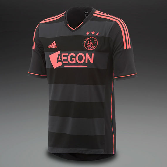
    The grey one here looks too much like a kids pajamas. what about something like the ajax kit from a few years back with the grey and black strips?

    or is it too similar to last years?

  20. #170
    Registered User
    Join Date
    Feb 2015
    Location
    Section 111 Row 26
    Posts
    47
    Mentioned
    0 Post(s)
    Tagged
    0 Thread(s)

    Default

    Here is a thought, do you think with the success of Giovinco, that TFC would adopt a Juve jersey style?

  21. #171
    Registered User
    Join Date
    Apr 2015
    Location
    114
    Posts
    985
    Mentioned
    0 Post(s)
    Tagged
    0 Thread(s)

    Default

    Quote Originally Posted by JollyBenjabi View Post
    Here is a thought, do you think with the success of Giovinco, that TFC would adopt a Juve jersey style?
    I don't thnk Giovinco would want too though

  22. #172
    RPB Member
    Moderator

    Join Date
    May 2008
    Location
    On the Interwebs
    Posts
    18,711
    Mentioned
    0 Post(s)
    Tagged
    0 Thread(s)

    Default

    Quote Originally Posted by JollyBenjabi View Post
    Here is a thought, do you think with the success of Giovinco, that TFC would adopt a Juve jersey style?
    Can't really see it. If they pick Juve, what do Roma, Lazio, etc. fans do?
    MLS is a tough, physical league, that emphasizes speed, and features plastic fields, grueling travel, extreme weather, and incompetent refs. - NK Toronto

  23. #173
    Registered User
    Join Date
    Mar 2012
    Posts
    2,469
    Mentioned
    0 Post(s)
    Tagged
    0 Thread(s)

    Default

    He came here to wear our colours not the other way around.

  24. #174
    Registered User
    Join Date
    Feb 2015
    Location
    Section 111 Row 26
    Posts
    47
    Mentioned
    0 Post(s)
    Tagged
    0 Thread(s)

    Default

    I should clarify, I meant adopt the style (stripes) but have it our own! Vertical Red Stripes and white body (or Red stripes and Black). But yes, he came here to play for us, not for them!

  25. #175
    Registered User
    Join Date
    May 2008
    Location
    Brampton
    Posts
    447
    Mentioned
    0 Post(s)
    Tagged
    0 Thread(s)

    Default

    White Shirt

    Onyx Adidas Striping and collar along with a thin red striping on the bottom of the sleeves.

    M
    onocromatic grey logo found on their website.

    My prediction...

    THIS SHIRT WILL BE UNDERWHELMING! I hope I'm wrong!!!

  26. #176
    Registered User
    Join Date
    May 2008
    Posts
    226
    Mentioned
    0 Post(s)
    Tagged
    0 Thread(s)

    Default

    Quote Originally Posted by JollyBenjabi View Post
    I should clarify, I meant adopt the style (stripes) but have it our own! Vertical Red Stripes and white body (or Red stripes and Black). But yes, he came here to play for us, not for them!
    Atlanta already claimed the red/black stripes look and red/white is way too similar to our red home shirt to be practical. Plus we don't want the stoke/sunderland vibes.

  27. #177
    Registered User
    Join Date
    May 2008
    Posts
    226
    Mentioned
    0 Post(s)
    Tagged
    0 Thread(s)

    Default

    Quote Originally Posted by zamperina View Post
    White Shirt

    Onyx Adidas Striping and collar along with a thin red striping on the bottom of the sleeves.

    M
    onocromatic grey logo found on their website.

    My prediction...

    THIS SHIRT WILL BE UNDERWHELMING! I hope I'm wrong!!!
    Pretty much guaranteed that it's going to be something like that.

  28. #178
    RPB Member
    Join Date
    Nov 2008
    Location
    Toronto
    Posts
    1,080
    Mentioned
    0 Post(s)
    Tagged
    0 Thread(s)

    Default

    I feel the TFC 2nd kit has usually been underwhelming (with exception of the first white one that gave us a collar and the kick ass Onyx).
    In the first 3 seasons it was identical to the 1st jersey in every way, except it was light grey. Dull.

  29. #179
    Registered User
    Join Date
    May 2015
    Posts
    41
    Mentioned
    0 Post(s)
    Tagged
    0 Thread(s)

    Default

    http://www.worldsoccershop.com/76723.html

    Something similar to the Bayern Munich 15/16 Away would be amazing. Instead of blue cuffs we could have red cuffs.

  30. #180
    Registered User
    Join Date
    Apr 2013
    Location
    Calgary, AB
    Posts
    240
    Mentioned
    0 Post(s)
    Tagged
    0 Thread(s)

    Default

    Quote Originally Posted by Captain View Post
    I opened my birthday present from my wife and it was a hand drawn version of this jersey on a cutout jersey shaped piece of paper. Apparently I'm getting the new away jersey for my present when it comes out, but in the meantime she was googling jersey rumors to try figure out what it would look like to draw it.

    How awesome is that?

    Now I really hope it's decent looking since I'll be the proud new owner of one... haha.


Posting Permissions

  • You may not post new threads
  • You may not post replies
  • You may not post attachments
  • You may not edit your posts
  •