Results 1 to 21 of 21
  1. #1
    RPB Member XI17 Moderator
    Join Date
    May 2008
    Location
    Oshawa, Ontario
    Posts
    8,510
    Mentioned
    0 Post(s)
    Tagged
    0 Thread(s)

    Default ATLANTA UNITED FC - Atlanta expansion team name, colours, and crest unveiled

    From mlssoccer.com:

    Atlanta's MLS expansion team, which kicks off in 2017, officially has a name, logo and club colors.

    Atlanta United FC unveiled their club badge and colors on Tuesday night at an event held for club supporters at a local midtown Atlanta establishment.


    Owner Arthur Blank, club president Darren Eales and technical director Carlos Bocanegra were all in attendance, and the reveal was made through a video narrated by long-time soccer commentator Jon Champion.


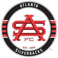
    The team's logo features a circle reminiscent of the city's seal and Olympic heritage with a bold "A" at the center of the circle. Behind the "A" are five black and red stripes representing the five pillars of the club: unity, determination, community, excellence and innovation.


    Atlanta United FC, who will play their home games in a new state-of-the-art, retractable-roof stadium in downtown, will sport three primary colors: black (symbol of strength and power), red (a reflection of pride and passion) and gold (representing excellence).


    The club also unveiled its new Twitter hashtag: #ATLUTD.

    Crest


    Home Top


    Thoughts on the look of the league's newest club?
    Did the USA , of all countries, just fix soccer? - C. Ronaldo, May 27th commenting on the FBI-led investigations into fraud and corruption throughout FIFA.

  2. #2
    Registered
    Join Date
    May 2008
    Location
    behind the sushi bar in montreal
    Posts
    1,141
    Mentioned
    0 Post(s)
    Tagged
    0 Thread(s)

    Default

    really nice colors and solid crest
    06-18-09 i was there

  3. #3
    Registered User
    Join Date
    Apr 2012
    Location
    Ottawa
    Posts
    3,239
    Mentioned
    0 Post(s)
    Tagged
    0 Thread(s)

    Default

    A design by focus group. I would have chosen different colors to stand out.

  4. #4
    Registered User
    Join Date
    May 2008
    Location
    Section 119
    Posts
    11,699
    Mentioned
    0 Post(s)
    Tagged
    0 Thread(s)

    Default

    Very sharp.

  5. #5
    Registered User
    Join Date
    May 2009
    Location
    scarborough
    Posts
    6,156
    Mentioned
    2 Post(s)
    Tagged
    0 Thread(s)

    Default

    meh.
    glad they're trying to carve out a distinct identity in the league. like dallas' hoops (or lack thereof), galaxies sash, etc.

  6. #6
    RPB Member XI17 Moderator
    Join Date
    May 2008
    Location
    Oshawa, Ontario
    Posts
    8,510
    Mentioned
    0 Post(s)
    Tagged
    0 Thread(s)

    Default

    Quote Originally Posted by ManUtd4ever View Post
    Very sharp.
    Agree for the most part. I think the crest could use more imagery that would actually represent the city more, but it's a pretty solid colour scheme - especially the gold.
    Did the USA , of all countries, just fix soccer? - C. Ronaldo, May 27th commenting on the FBI-led investigations into fraud and corruption throughout FIFA.

  7. #7
    Registered User
    Join Date
    Apr 2015
    Location
    114
    Posts
    985
    Mentioned
    0 Post(s)
    Tagged
    0 Thread(s)

    Default

    I like everything except the "united" part of the name.

  8. #8
    Registered User
    Join Date
    May 2008
    Posts
    17,203
    Mentioned
    1 Post(s)
    Tagged
    0 Thread(s)

    Default

    It is absolutely identical to the AC Milan kit a couple of years ago
    “What the world needs is more geniuses with humility; there are so few of us left.”

  9. #9
    Registered User
    Join Date
    May 2008
    Location
    225 (sometimes)
    Posts
    1,064
    Mentioned
    0 Post(s)
    Tagged
    0 Thread(s)

    Default

    wait you guys like that crest?

    it looks like windows clipart.

  10. #10
    RPB Member
    Moderator

    Join Date
    May 2008
    Location
    Centre of My Bloody Universe.
    Posts
    19,075
    Mentioned
    2 Post(s)
    Tagged
    0 Thread(s)

    Default


    This can never be topped.
    FORMER FULL TIME KOOL-AID DRINKER

  11. #11
    Registered User
    Join Date
    May 2008
    Location
    Section 119
    Posts
    11,699
    Mentioned
    0 Post(s)
    Tagged
    0 Thread(s)

    Default

    Quote Originally Posted by Fort York Redcoat View Post


    This can never be topped.
    LOL. A bit of perspective is always good.

  12. #12
    Registered User
    Join Date
    May 2008
    Location
    Stoke-on-Toronto
    Posts
    8,800
    Mentioned
    0 Post(s)
    Tagged
    0 Thread(s)

    Default

    Shit.

    Look forward to getting 3 pts from them each time.

  13. #13
    Registered User
    Join Date
    May 2008
    Posts
    399
    Mentioned
    0 Post(s)
    Tagged
    0 Thread(s)

    Default

    Quote Originally Posted by ManUtd4ever View Post
    LOL. A bit of perspective is always good.
    This is the silverbacks current badge that has been in use for a few years


  14. #14
    Banned
    Join Date
    May 2008
    Location
    Tahrawnah
    Posts
    2,147
    Mentioned
    0 Post(s)
    Tagged
    0 Thread(s)

    Default

    Not a surprising choice of colours. Arthur Blank's Atlanta Falcons wear black and red. It'll simplify stadium décor, unlike, say, BMO Field where, ohh fcuk it, don't even want to think about it.

  15. #15
    RPB Member XI17 Moderator
    Join Date
    May 2008
    Location
    Oshawa, Ontario
    Posts
    8,510
    Mentioned
    0 Post(s)
    Tagged
    0 Thread(s)

    Default

    Quote Originally Posted by MKR View Post
    wait you guys like that crest?

    it looks like windows clipart.
    I like the colour scheme. Red, black, and gold works well like that. But like I said, it could use more imagery than just a simple A. Apparently, the designers were trying to invoke the theme of Atlanta's rail heritage (hence the 2 vertical black bars in the centre of the crest), but I think something more obvious would have been better. Incorporating something like rail spikes or a level crossing sign (crossbuck) might have worked. A lot of MLS clubs are playing it safe nowadays with minimalist and/or abstract crests.

    I do happen to like their supporter's group logo, though:

    Last edited by Cashcleaner; 07-18-2015 at 05:20 PM.
    Did the USA , of all countries, just fix soccer? - C. Ronaldo, May 27th commenting on the FBI-led investigations into fraud and corruption throughout FIFA.

  16. #16
    Registered User
    Join Date
    May 2008
    Location
    Stoke-on-Toronto
    Posts
    8,800
    Mentioned
    0 Post(s)
    Tagged
    0 Thread(s)

    Default

    ^^^^ They aren't by any chance an AHL team aswell, are they?

  17. #17
    RPB Member
    Moderator

    Join Date
    May 2008
    Location
    Centre of My Bloody Universe.
    Posts
    19,075
    Mentioned
    2 Post(s)
    Tagged
    0 Thread(s)

    Default

    Quote Originally Posted by Cashcleaner View Post
    I like the colour scheme. Red, black, and gold works well like that. But like I said, it could use more imagery than just a simple A. Apparently, the designers were trying to invoke the theme of Atlanta's rail heritage (hence the 2 vertical black bars in the centre of the crest), but I think something more obvious would have been better. Incorporating something like rail spikes or a level crossing sign (crossbuck) might have worked. A lot of MLS clubs are playing it safe nowadays with minimalist and/or abstract crests.

    I do happen to like their supporter's group logo, though:


    Hmmm looks like a friendly place
    FORMER FULL TIME KOOL-AID DRINKER

  18. #18
    Registered User
    Join Date
    May 2008
    Location
    Ossington Ave
    Posts
    8,607
    Mentioned
    1 Post(s)
    Tagged
    0 Thread(s)

    Default

    Quote Originally Posted by __wowza View Post
    meh.
    glad they're trying to carve out a distinct identity in the league. like dallas' hoops (or lack thereof), galaxies sash, etc.
    this.
    nothing about the name or look that makes it anythign special

  19. #19
    Registered User
    Join Date
    Apr 2011
    Location
    112
    Posts
    2,839
    Mentioned
    0 Post(s)
    Tagged
    0 Thread(s)

    Default

    Quote Originally Posted by Mateo1985 View Post
    I like everything except the "united" part of the name.
    Agreed. Shite generic club name but a pretty decent looking top.

  20. #20
    Registered User
    Join Date
    Sep 2014
    Posts
    165
    Mentioned
    0 Post(s)
    Tagged
    0 Thread(s)

    Default

    Agree with the general consensus. Solid jersey and colours but pretty bad crest and name. Silverbacks badge was better with a classic look.

  21. #21
    Registered User
    Join Date
    May 2008
    Posts
    1,144
    Mentioned
    0 Post(s)
    Tagged
    0 Thread(s)

    Default

    Rubbermaid for plastic fans haha


Posting Permissions

  • You may not post new threads
  • You may not post replies
  • You may not post attachments
  • You may not edit your posts
  •