I liked Portland's first 3rd kit (the white one) and I like this green and gold one even more. More hits than misses this season (based on the representations at least).


I liked Portland's first 3rd kit (the white one) and I like this green and gold one even more. More hits than misses this season (based on the representations at least).
I might have to get a Green and Gold Urruti shirt. Boom.

I quite like our Black and Red 3rd kit, but THAT is sick. And I normally hate the Sounders kitsOriginally Posted by Captain


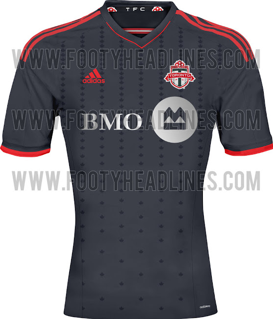
Think this goes down as one o my favorite TFC kits ever.
All personal preference though. I thought it was interesting that a lot of people called this overly nationalistic to the point of being tacky. That's exactly how I feel about our current home jersey, and the reflective maple leaf ends up looking like a sweat stain.
Side note: we should consider ourselves lucky we have a sponsor that reasonably fits in with our kit design. I can't image barbasol or advocare splashed across the front to the point of being tacky.

SKC's new secondary hoops is awesome.


^ Agreed! Looks sharp. I also just noticed that each shirt is constructed totally different as well. Look at the collars and sleeves and you'll see what I mean.
Did the USA , of all countries, just fix soccer? - C. Ronaldo, May 27th commenting on the FBI-led investigations into fraud and corruption throughout FIFA.
SKC has all 3 kits looking sharp. Lucky for their fans.
 Posting Permissions


 Reply With Quote