Hypercolor kits with Surf Style warmup gear? Classy.


Hypercolor kits with Surf Style warmup gear? Classy.
You understand why the Maple Leaf is on the new kit don't you?
We are after all the Toronto Football Leafs.
Sporting KC unveiled a new kit and sponsor today:


I want 2 of what he's on.Originally Posted by Jahinho_Guerro

Edit: As a general comment, WOW have MLS jerseys come a long way from the cartoons in the 90s to the eh jerseys when TFC came in. I actually like most of these kits. And if I didn't despise their cities/teams with most fibers of my being, there's a few I'd stronger consider purchasing.

Could this be a new number font for all MLS kits this year?
Video:
TORONTO FC, 2017 MLS CHAMPIONS!!! (Still the greatest in league history!)
^^It appears the answer is yes!

Last edited by Redcoe15; 01-19-2013 at 11:22 PM. Reason: Some might not have seen the image.
TORONTO FC, 2017 MLS CHAMPIONS!!! (Still the greatest in league history!)

Thank God! the numbers now are unreadable and awful looking

Here is the link to order the new numbering.
http://uni-sport.com/toronto-numbers.html?prod_id=68
Remember The Man, The Legend, The Goal 5-12-07 and All That #9 Left On The Pitch, Thanks For The Memories !!!
new numbers look great.
Big fan on the numbers and new TFC kit. Looking forward to adding one to the collection.
I think this is what the backs of TFC will look like with the new font:

TORONTO FC, 2017 MLS CHAMPIONS!!! (Still the greatest in league history!)
Parody time. Party time. I'll be getting a knock-off done of this shirt. Big, dye-subbed cannabis leaves with a THC logo. Maybe spin the sponsor logo a bit, make it into the word MON with a smaller Yeah, above the M.
Even better, make the sponsor Cheeba Chews.


Last edited by __wowza; 01-25-2013 at 08:59 PM.
the "three star"

I will buy one of these if you're serious.

Can the front office please also fire the person(s) responsible for deciding on the design of our shirt?
Hire the Seattle or LA people cause their kits are always way better.
Seriously? Seattle have had the worst football kits I have ever seen.

I'm with you dude.
I've never been a big fan of any TFC shirt designs.
The ones you mentioned are way more sleek and stylish.

The actual TFC kit looks far better than the rendition posted above.
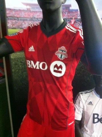

is there like a high res version of the shirt coming out soon? all i see is that grainy photo, while all the other jerseys are coming out with high res images. Would love to see a high res version of this.

Let me know if u are serious. I'm sure I know enough guys to fill an order.

How'd you mock that up?
I used Inkscape, an SVG illustrator. I then used these as templates:

TORONTO FC, 2017 MLS CHAMPIONS!!! (Still the greatest in league history!)
these are the official leaks from MLSsoccer.com or MLSgear
AWAY
AWAY
THIRD
.jpg)
wowza holding it down in the fashion thread!!


Rapids away....

that is awesome ^^^^^^^^^^^^^
Have to agree with Gabe that looks good. Working in the state logo and colours in the jersey.
At first blush Portland home jersey looks good, I get what they're doing but I don't like it as much after.
This Colorado one takes some getting used to but it's great.
Houston's 3rd is good too.
As TFC's I really want to like it but it just seems too "busy".
Either way as someone else pointed out, MLS jerseys have come a long way.
^ The watermark and colour selection is great. I just see a bit of overkill with the Colorado state logo in the background and a flag as well (similar to our Maple Leafs plastered everywhere).
I can't stand when a team does not use their proper crest. Thats what bugs me. It makes it look cheap and un-authentic.
 Posting Permissions


 Reply With Quote


.jpg)
.jpg)
.jpg)
.jpg)

.jpg)