Page 2 of 8 FirstFirst 123456 ... LastLast
Results 31 to 60 of 211
  1. #31
    RPB Member
    Join Date
    Feb 2009
    Location
    Oshawa
    Posts
    634
    Mentioned
    0 Post(s)
    Tagged
    0 Thread(s)

    Default

    Quote Originally Posted by __wowza View Post
    explaaaaaaaain. im intrigued now. i didnt get this years shirt for the exact same reason (well, that and i also really dig the collar on our previous one)


    yup, they are. i cant really complain though. adidas gives the league a boatload of cash for exclusive sponsorship, which in turn helps the league stay financial viable. as much as id love to see different designs from different manufacturers, im sure in 10-20 years we'll see some other companies made headway into the league.
    I hate how the guy can only wear adidas!! There are so many amazing designs out there from other companys. I deal with jerseys on a daily basis (jersery designer) so I have seen some really nice patterns.

  2. #32
    Registered
    Join Date
    Jun 2009
    Location
    section 114 row 1 all season
    Posts
    426
    Mentioned
    0 Post(s)
    Tagged
    0 Thread(s)

    Default

    Quote Originally Posted by renda-10 View Post
    I hate how the guy can only wear adidas!! There are so many amazing designs out there from other companys. I deal with jerseys on a daily basis (jersery designer) so I have seen some really nice patterns.
    i tottaly agree i also think that our crest would look very sharp on a nike jersey aswell i think next years away jersey should look like this
    Attached Images Attached Images
    Ai estes são os Ultras do Benfica Primeiros a nascer
    Odiamos os tripeiros Queremos ver o Porto a arder
    DIABOS VERMELHOS 1982

  3. #33
    Registered User
    Join Date
    Dec 2008
    Location
    Ajax
    Posts
    2,050
    Mentioned
    0 Post(s)
    Tagged
    0 Thread(s)

    Default


  4. #34
    Registered User
    Join Date
    May 2009
    Location
    scarborough
    Posts
    6,156
    Mentioned
    2 Post(s)
    Tagged
    0 Thread(s)

    Default

    ^ closeups:


  5. #35
    Registered User
    Join Date
    Dec 2012
    Location
    Trawna
    Posts
    435
    Mentioned
    0 Post(s)
    Tagged
    0 Thread(s)

    Default

    Hahahh I got that "ugly" 3rd supporter designed jersey for christmas. I actually dont mind it. Are we really getting a new home kit?

  6. #36
    Registered User
    Join Date
    Apr 2011
    Location
    112
    Posts
    2,839
    Mentioned
    0 Post(s)
    Tagged
    0 Thread(s)

    Default

    someone on U-Sec has apparently seem them (our new reds) but wasn't allowed to take a photo.

    here's his best attempt to create what it looked like: http://imgur.com/fKBEe


    If true, I love the look.

  7. #37
    Registered User
    Join Date
    May 2008
    Location
    Whitby
    Posts
    3,770
    Mentioned
    0 Post(s)
    Tagged
    0 Thread(s)

    Default

    ^^I've seen that picture and I don't really like it. Much too busy. And I know we're Canadian and I'm as proud as anyone but I think the leaf needs to be scaled back across the board for TFC. We are NOT the Maple Leafs.


    Dom

  8. #38
    Registered User
    Join Date
    May 2008
    Location
    F5
    Posts
    15,339
    Mentioned
    0 Post(s)
    Tagged
    0 Thread(s)

    Default

    Yikes, maybe that's just a matter of artist rendition, but regardless I'm getting a little tired of the flag being a staple of the uniform. To a certain degree I think the way it's been done is tacky and asides from that I don't understand what we're getting at. Are we claiming to be more Canadian than the other two teams? Do we have some kind of stronger commitment to Canada? I don't get it.

  9. #39
    Registered User
    Join Date
    May 2011
    Posts
    394
    Mentioned
    0 Post(s)
    Tagged
    0 Thread(s)

    Default

    Quote Originally Posted by ag futbol View Post
    Yikes, maybe that's just a matter of artist rendition, but regardless I'm getting a little tired of the flag being a staple of the uniform. To a certain degree I think the way it's been done is tacky and asides from that I don't understand what we're getting at. Are we claiming to be more Canadian than the other two teams? Do we have some kind of stronger commitment to Canada? I don't get it.
    I would argue that so far we have been far more Canadian.
    Whether or not that is a good thing in terms of the product on the field is another conversation.

    Either way there is a clear Canada fetish, from player acquisitions, to marketing, to adding as many maple leaves as possible on each new jersey...

  10. #40
    Registered User
    Join Date
    May 2011
    Posts
    394
    Mentioned
    0 Post(s)
    Tagged
    0 Thread(s)

    Default

    Quote Originally Posted by __wowza View Post
    ^ closeups:


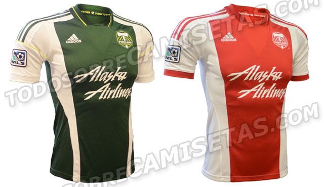
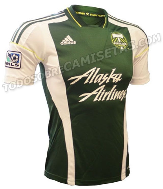
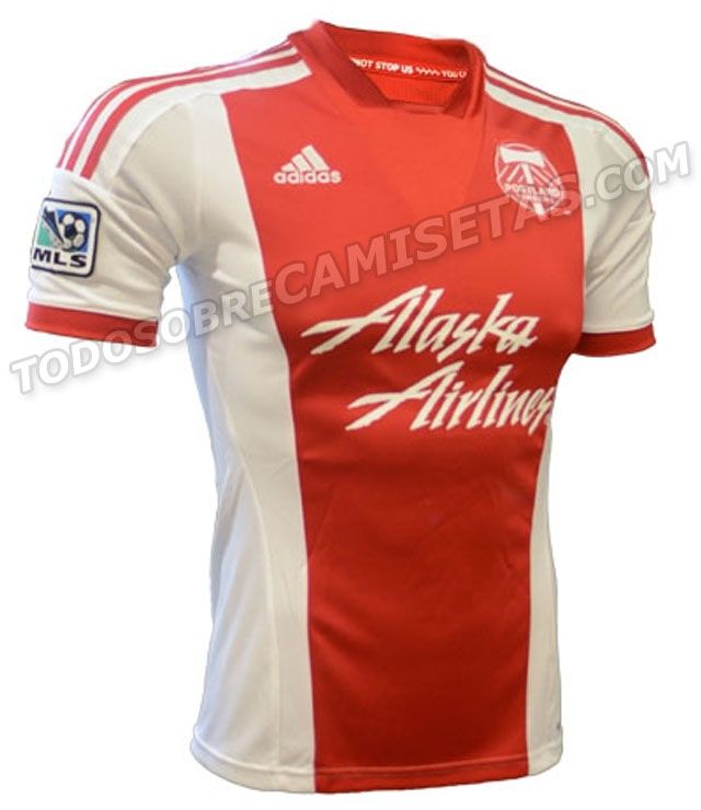
    These are so sexy... more particularly the red one... So far Portland has been smashing everyone else in the league in this regard... TFC should be taking some notes

  11. #41
    Registered User
    Join Date
    May 2008
    Location
    Dump and Chase!!!!!
    Posts
    8,868
    Mentioned
    0 Post(s)
    Tagged
    0 Thread(s)

    Default

    ^^^ i dissagree 100%, they are ugly and not as nice as the kits they wore this season.

  12. #42
    Registered User
    Join Date
    May 2008
    Location
    F5
    Posts
    15,339
    Mentioned
    0 Post(s)
    Tagged
    0 Thread(s)

    Default

    I think those are pretty nice, similar to what they've got. Shows how having a good sponsor logo that fits with the kit can make a huge difference. The alaska air logo is so natural it's hardly felt.

  13. #43
    Registered User
    Join Date
    May 2008
    Location
    We The North
    Posts
    7,042
    Mentioned
    0 Post(s)
    Tagged
    0 Thread(s)

    Default

    That TFC jersey looks more like Canadian national team jersey. TFC love for Maple Leafs was originally because we were only Canadian team in MLS back in couple of years ago, but now there are two other Canadian teams in MLS. So maybe it's time to get rid of Maple Leaf (and TFC logo for that matter) and design a new identity around this:

  14. #44
    Registered User
    Join Date
    May 2008
    Location
    F5
    Posts
    15,339
    Mentioned
    0 Post(s)
    Tagged
    0 Thread(s)

    Default

    Quote Originally Posted by Jpexxx View Post
    I would argue that so far we have been far more Canadian.
    Whether or not that is a good thing in terms of the product on the field is another conversation.

    Either way there is a clear Canada fetish, from player acquisitions, to marketing, to adding as many maple leaves as possible on each new jersey...
    I hear ya. If I had a word to describe the relationship between this club and canada in a general sense I would have to go with awkward.

    Clearly the marketing people think Canada is a selling point. The GMs /coaches have seen it from everything between a positive and a negative. We cut half the Canadians on our roster in the offseason and have no plans to sign any kids this year.

    That's what I find so odd. We have such a hard-on for pointing out how Canadian we are yet we are scatterbrained about how we want to express that in terms of player policy: the place where it matters most.

    Maybe it's just me but this feels like a Toronto team to me as opposed to team Canada. I don't think we have more non-local support than the other team and it seems like the Toronto-raised player that really gravitates to the squad as opposed to Canucks in general.

    I'd rather we go with that, just feels more honest.

  15. #45
    RPB Member
    Join Date
    Jul 2008
    Location
    Fort Kickass!
    Posts
    5,423
    Mentioned
    0 Post(s)
    Tagged
    0 Thread(s)

    Default

    What's not to like about an all red jersey for our side?
    TORONTO FC, 2017 MLS CHAMPIONS!!! (Still the greatest in league history!)

  16. #46
    RPB Member XI17 Moderator
    Join Date
    May 2008
    Location
    Oshawa, Ontario
    Posts
    8,510
    Mentioned
    0 Post(s)
    Tagged
    0 Thread(s)

    Default

    ^ Agreed. An all-red TFC home jersey is what I've been wanting to see for a very long time.
    Did the USA , of all countries, just fix soccer? - C. Ronaldo, May 27th commenting on the FBI-led investigations into fraud and corruption throughout FIFA.

  17. #47
    Registered User
    Join Date
    May 2009
    Location
    scarborough
    Posts
    6,156
    Mentioned
    2 Post(s)
    Tagged
    0 Thread(s)

    Default

    Quote Originally Posted by London View Post
    ^^^ i dissagree 100%, they are ugly and not as nice as the kits they wore this season.
    NOTHING can beat their first kits. It's a blessing and a curse, they start out with arguably the best kits in the league, there's nowhere else to go but down.

    Having said that, there's still aren't that bad.

  18. #48
    RPB Member
    Join Date
    Apr 2009
    Location
    Section 112 and Cardinal, Ontario...Yeah, Baby!
    Posts
    2,043
    Mentioned
    0 Post(s)
    Tagged
    0 Thread(s)

    Default

    I like the shaded maple leaf on the shirts. I'm not sure I like what appear to be upside down ones...too many possible jokes about fallen leaves for my liking.

    What might be cool would be for the CSA to only allow a large maple leaf (shaded, or overt) on the shirts of the Voyageurs Cup winners from the previous year.
    O, Maple Leaf around the world, You speak as you rise high above,
    Of courage, peace and quiet strength, Of the Canada that I love.
    Remind us all, our union bound by ties we cannot sever,
    Bright flag revered on every ground, The Maple Leaf forever

  19. #49
    Registered User
    Join Date
    Oct 2008
    Posts
    1,034
    Mentioned
    0 Post(s)
    Tagged
    0 Thread(s)

    Default

    I agree with posters above this "Canada B" thing is going to far.


    Why can't we just be Toronto, our city flag has blue for goodness sake.

  20. #50
    Registered User
    Join Date
    May 2008
    Location
    Dump and Chase!!!!!
    Posts
    8,868
    Mentioned
    0 Post(s)
    Tagged
    0 Thread(s)

    Default

    Quote Originally Posted by __wowza View Post
    NOTHING can beat their first kits. It's a blessing and a curse, they start out with arguably the best kits in the league, there's nowhere else to go but down.

    Having said that, there's still aren't that bad.


    your right, the first kit the had was sweet, and the first rose city kit was even better.


    I also wish TFC would drop the whole "maple leaf" graphic, its more suited for the CMNT

  21. #51
    Registered User
    Join Date
    May 2008
    Location
    Dump and Chase!!!!!
    Posts
    8,868
    Mentioned
    0 Post(s)
    Tagged
    0 Thread(s)

    Default

    Quote Originally Posted by DoubleUp View Post
    I agree with posters above this "Canada B" thing is going to far.


    Why can't we just be Toronto, our city flag has blue for goodness sake.
    I agree, REP Toronto first and foremost


    what If all the US teams had giant stars and stripes all over the kit, what would people in Canada think???

  22. #52
    Registered User
    Join Date
    Jul 2011
    Posts
    8,098
    Mentioned
    0 Post(s)
    Tagged
    0 Thread(s)

    Default

    I like the direction of more red and less gray, but the maple leaf thing is too much. I wouldn't buy this kit.

  23. #53
    RPB Member
    Past-President

    Join Date
    May 2008
    Location
    112 - RPB
    Posts
    12,909
    Mentioned
    3 Post(s)
    Tagged
    0 Thread(s)

    Default

    Quote Originally Posted by ryan View Post
    someone on U-Sec has apparently seem them (our new reds) but wasn't allowed to take a photo.

    here's his best attempt to create what it looked like: http://imgur.com/fKBEe


    If true, I love the look.
    I know what they were trying to do with that rendering but it doesn't capture it.

    There are a lot of little details and the central leaf stuff is different that whats depicted there. Its going to be one of those 'bold' shirts though, it will turn some off and inspire others.
    Road Trips: July 7 2007 Chicago, July 22nd 2007 Columbus, August 11 2007 NY, October 13 2007 LA, March 29 2008 Columbus, May 24th 2008 DC, May 26 2008 Montreal, June 28th 2008 NE, March 7-11-14 2009 Charleston, March 28 2009 Columbus, April 10 2010 New England, May 12 2010 Montreal, April 7 2012 Montreal, March 16 2013 Montreal , June 3 2014 Montreal, March 14 2015 Columbus

    Twitter: @RPBPhil

  24. #54
    Registered User
    Join Date
    Jan 2012
    Location
    Etobicoke
    Posts
    816
    Mentioned
    0 Post(s)
    Tagged
    0 Thread(s)

    Default

    Quote Originally Posted by Huyton View Post
    I like the shaded maple leaf on the shirts. I'm not sure I like what appear to be upside down ones...too many possible jokes about fallen leaves for my liking.

    What might be cool would be for the CSA to only allow a large maple leaf (shaded, or overt) on the shirts of the Voyageurs Cup winners from the previous year.
    A badge of honour, great idea!

    The leaf is nice IMO, but I understand the anger/disgust with relations to the Maple Leafs. It is lacking in creativity.

    Relation to Canada: Only part of Canada known to most of the world. Capital of the most populous Province. Canadian champs 4 years running, furthest in CCL.

  25. #55
    Registered User
    Join Date
    Jul 2011
    Posts
    8,098
    Mentioned
    0 Post(s)
    Tagged
    0 Thread(s)

    Default

    Quote Originally Posted by Phil View Post
    I know what they were trying to do with that rendering but it doesn't capture it.

    There are a lot of little details and the central leaf stuff is different that whats depicted there. Its going to be one of those 'bold' shirts though, it will turn some off and inspire others.
    Hopefully it's a bit more subtle than what they can show on a graphic depiction.

  26. #56
    RPB Member XI17 Moderator
    Join Date
    May 2008
    Location
    Oshawa, Ontario
    Posts
    8,510
    Mentioned
    0 Post(s)
    Tagged
    0 Thread(s)

    Default

    Quote Originally Posted by DoubleUp View Post
    I agree with posters above this "Canada B" thing is going to far.


    Why can't we just be Toronto, our city flag has blue for goodness sake.
    Totally agreed. I think the Canadian imagery is okay in small amounts, but we've already got a red-and-white colour scheme, maple leaf motif on the club crest, and Canadian flag on the sleeves. Shouldn't all that be enough?

    By the way, how cool would it be to have the Toronto city flag on one of the sleeves? I think it could work.
    Did the USA , of all countries, just fix soccer? - C. Ronaldo, May 27th commenting on the FBI-led investigations into fraud and corruption throughout FIFA.

  27. #57
    Registered User
    Join Date
    May 2008
    Location
    F5
    Posts
    15,339
    Mentioned
    0 Post(s)
    Tagged
    0 Thread(s)

    Default

    ^ yep. Our uni's are more overtly Canadian than the nats, which is odd to say the least.

  28. #58
    Registered User
    Join Date
    May 2008
    Location
    F5
    Posts
    15,339
    Mentioned
    0 Post(s)
    Tagged
    0 Thread(s)

    Default

    Quote Originally Posted by bigredone View Post
    Relation to Canada: Only part of Canada known to most of the world. Capital of the most populous Province. Canadian champs 4 years running, furthest in CCL.
    I think you've been caught in some creative marketing man. We can craft all sorts of logic for each region about how Canadian they are, big dick waving contest. People from BC often go on and on about how it's the "soccer capital of Canada". Why? Haven't seen a good argument yet, but they like to stake claim for that one.

    Although, I have to admit going out against other Canadian teams while flying the flag under this logic is rather funny, almost like we're trolling them. Move over VC and Mtl the 'Canadians' are here! Lol

  29. #59
    Registered User
    Join Date
    Apr 2011
    Location
    112
    Posts
    2,839
    Mentioned
    0 Post(s)
    Tagged
    0 Thread(s)

    Default

    Quote Originally Posted by DoubleUp View Post
    I agree with posters above this "Canada B" thing is going to far.


    Why can't we just be Toronto, our city flag has blue for goodness sake.
    Our city flag has a red maple leaf too.

  30. #60
    Registered User
    Join Date
    Oct 2008
    Posts
    1,034
    Mentioned
    0 Post(s)
    Tagged
    0 Thread(s)

    Default

    Quote Originally Posted by ryan View Post
    Our city flag has a red maple leaf too.

    But it encompasses more than just red and white. Maybe its to late now but the club and kit should have reflected that.


Posting Permissions

  • You may not post new threads
  • You may not post replies
  • You may not post attachments
  • You may not edit your posts
  •