Page 1 of 8 12345 ... LastLast
Results 1 to 30 of 211
  1. #1
    Registered User
    Join Date
    May 2009
    Location
    scarborough
    Posts
    6,156
    Mentioned
    2 Post(s)
    Tagged
    0 Thread(s)

    Cool 13/14 MLS kit watch

    premature, yes? well apparently not. the rapids have unveiled their new 13/14 kit for the season during a supporters appreciation night. pics are after the blurb. although it's premature, let's try and resurrect this thread when the rest of the MLS kits start coming out, it'll answer a lot of questions, i'll try and keep it updated if we find out dates when the kits being released. so keep us posted. also, if you spot any mistakes, let me know.

    READ THIS PART FIRST.

    here's a rundown of where everyone stands in terms of kits for NEXT SEASON based off of the 2 year rule. please note that everything that reads "no change" technically means that these teams will have a new kit for the 14/15 season. im also working under the assumption that each team with a third kit will also be following the 2 year rule if they do end up changing their kit (unless otherwise noted). nothing here is mentioned about teams that had a third kit for the 11/12 season but didn't for the 12/13 season, so we may very well see a few of those without prior notice. we also might see a team switch up a third kit a year after releasing it, so the third kit category should be seen as a toss up. also note, i'm going to be counting shorts variations (NYRB/PT) as a single kit and not a new one (ie: portland switching from green to white shorts does not count as a new kit).

    HOME AWAY THIRD
    CHICAGO no change no change
    CHIVAS no change new kit
    COLORADO new kit new kit
    COLUMBUS no change no change
    DC no change no change new kit
    DALLAS no change no change
    HOUSTON new kit new kit no change
    LA no change new kit new kit
    MONTREAL no change no change
    NEW ENGLAND no change no change
    NEW YORK no change no change new kit *
    PHILADELPHIA no change no change new kit
    PORTLAND new kit ** new kit no change
    SALT LAKE no change no change
    SEATTLE new kit new kit*** no change
    KANSAS new kit new kit
    TORONTO new kit no change
    VANCOUVER new kit new kit no change


    * team had a third kit with a variation on shorts
    ** team had a home kit with a variation on shorts
    *** team has changed kit twice over the course of 2 years
    Last edited by __wowza; 09-11-2012 at 12:45 PM.

  2. #2
    Registered User
    Join Date
    May 2009
    Location
    scarborough
    Posts
    6,156
    Mentioned
    2 Post(s)
    Tagged
    0 Thread(s)

    Default


    those black stripes your looking at are the names of all of the seasons seat holder for the current season. a nice gesture overall, but it doesn't really do anything for a plain looking kit (these guys need a sponsor badly). also.. according to the presser, the white sleeves are due to their partnership with arsenal.. although colorado seem to have won more silverware over the past couple of years (sorry, couldn't resist!).

  3. #3
    Registered
    Join Date
    May 2008
    Location
    low earth orbit
    Posts
    5,517
    Mentioned
    2 Post(s)
    Tagged
    1 Thread(s)

    Default

    premature, yes? well apparently not. the rapids have unveiled their new 13/14 kit for the season during a supporters appreciation night. pics are after the blurb. although it's premature, let's try and resurrect this thread when the rest of the MLS kits start coming out, it'll answer a lot of questions, i'll try and keep it updated if we find out dates when the kits being released. so keep us posted. also, if you spot any mistakes, let me know.
    Nice.

    BTW, the 5280 on the back of the shirt there refers to 'feet above sea level'.
    a ha ha heh he hoo.. ha

  4. #4
    Registered User
    Join Date
    May 2009
    Location
    scarborough
    Posts
    6,156
    Mentioned
    2 Post(s)
    Tagged
    0 Thread(s)

    Default

    also, LA are having a third kit voting contest (similar to what we had but with more variations). the final two are up, and it'll be revealed early next month. it's in between a throwback to their early years, and what looks to be their goalkeepers kit. here's the other 2 first

    3rd place
    4th place

    personally i think the third place and throwback are the nicest.


  5. #5
    RPB Member
    Join Date
    Jul 2008
    Location
    Fort Kickass!
    Posts
    5,423
    Mentioned
    0 Post(s)
    Tagged
    0 Thread(s)

    Default

    suuuuuuuuuuuucks!!!!!!!!!!
    TORONTO FC, 2017 MLS CHAMPIONS!!! (Still the greatest in league history!)

  6. #6
    Registered User
    Join Date
    May 2008
    Posts
    3,331
    Mentioned
    0 Post(s)
    Tagged
    0 Thread(s)

    Default

    LA 3rd place jersey is UGLYYYYYY!!!!!!!

    LA 4th Place is nice tho.

    Colorado pretty nice jersey!

  7. #7
    Registered User
    Join Date
    May 2009
    Location
    scarborough
    Posts
    6,156
    Mentioned
    2 Post(s)
    Tagged
    0 Thread(s)

    Default

    rumoured montreal 3rd.


    edit: re-uped the third kit picture.
    Last edited by __wowza; 12-19-2012 at 04:36 PM.

  8. #8
    Registered User
    Join Date
    Aug 2011
    Location
    Oshawa
    Posts
    212
    Mentioned
    0 Post(s)
    Tagged
    0 Thread(s)

    Default

    I sure hope as a sign of the times, they wipe the slate clean and give us somthing breath taking. red jerseys are the best colour to show off. i hate the grey's and the tribal squiggles. i mean look at liverpool jerseys, man u etc i really like this swiss national jersey. they should put the bmo in the top corner like credit suisse or move it to the upper back or make it more transparent.
    Last edited by dutch; 12-17-2012 at 11:51 PM.

  9. #9
    Registered User
    Join Date
    Jul 2011
    Location
    Scarborough
    Posts
    993
    Mentioned
    3 Post(s)
    Tagged
    1 Thread(s)

    Default

    I hate to admit it, but Montreal's 3rd jersey looks really nice.

  10. #10
    Registered User
    Join Date
    Aug 2011
    Location
    Oshawa
    Posts
    212
    Mentioned
    0 Post(s)
    Tagged
    0 Thread(s)

    Default

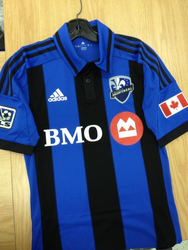
    another great clean jersey

  11. #11
    Registered User
    Join Date
    May 2011
    Posts
    2,619
    Mentioned
    0 Post(s)
    Tagged
    0 Thread(s)

    Default

    Please make ours look good. I was partial to the 2011 one when it was first introduced but over time I started to hate it. It was way to busy with the Canadian flag and the grey sleeves.

    We are the Reds. Just make it red.

  12. #12
    RPB Member
    Join Date
    May 2009
    Location
    Roncy
    Posts
    1,082
    Mentioned
    0 Post(s)
    Tagged
    0 Thread(s)

    Default


    At a glance, I thought this was a new South African National Team kit.

  13. #13
    Registered User
    Join Date
    May 2008
    Location
    Section 119
    Posts
    11,698
    Mentioned
    0 Post(s)
    Tagged
    0 Thread(s)

    Default

    Those Montreal jerseys are going to sell like hotcakes in Quebec, especially to all the Inter fans.

  14. #14
    Registered User
    Join Date
    May 2008
    Location
    GUELPH
    Posts
    900
    Mentioned
    0 Post(s)
    Tagged
    0 Thread(s)

    Default

    i LOVE THOSE mONTREAL 3rd Jerseys

  15. #15
    Registered User
    Join Date
    May 2009
    Location
    scarborough
    Posts
    6,156
    Mentioned
    2 Post(s)
    Tagged
    0 Thread(s)

    Default

    Quote Originally Posted by ManUtd4ever View Post
    Those Montreal jerseys are going to sell like hotcakes in Quebec, especially to all the Inter fans.
    yup. its a throwback to the clubs inception when they used to rock the inter stripes (hence the black/blue stripes on their crest).
    personally, i think theyre trying to take TFC in the direction of an evil arsenal. i hope the grey sleeves dont become a staple in the future.

  16. #16
    RPB Member
    Past-President

    Join Date
    May 2008
    Location
    112 - RPB
    Posts
    12,909
    Mentioned
    3 Post(s)
    Tagged
    0 Thread(s)

    Default

    Quote Originally Posted by __wowza View Post
    yup. its a throwback to the clubs inception when they used to rock the inter stripes (hence the black/blue stripes on their crest).
    personally, i think theyre trying to take TFC in the direction of an evil arsenal. i hope the grey sleeves dont become a staple in the future.
    New jersey is very red from what I hear. Not much grey to speak of at all.
    Road Trips: July 7 2007 Chicago, July 22nd 2007 Columbus, August 11 2007 NY, October 13 2007 LA, March 29 2008 Columbus, May 24th 2008 DC, May 26 2008 Montreal, June 28th 2008 NE, March 7-11-14 2009 Charleston, March 28 2009 Columbus, April 10 2010 New England, May 12 2010 Montreal, April 7 2012 Montreal, March 16 2013 Montreal , June 3 2014 Montreal, March 14 2015 Columbus

    Twitter: @RPBPhil

  17. #17
    Registered User
    Join Date
    Dec 2009
    Location
    Nordrhein-Westfalen, GER
    Posts
    1,258
    Mentioned
    1 Post(s)
    Tagged
    0 Thread(s)

    Default

    Two things:

    A little confused as to why no one's posted (or, I couldn't see) the rumoured Montreal 3rd kit, in this thread.

    That said, I found it and, for me, it appears to be a photoshoped effort -- quite clearly, even.. but, it would appear that such a view is in minority (read: take with a grain of salt).

    ** * **

    Neat, all the same and I'm looking forward to our new jersey; like most, I was a little skeptical on our 2011 home kit.. but, it grew on me. Still, I don't think I was ever so wowed by it and I hope this new one can achieve just that.
    Last edited by JuliquE; 12-18-2012 at 05:02 PM.

  18. #18
    RPB Member
    Join Date
    Jul 2008
    Location
    Fort Kickass!
    Posts
    5,423
    Mentioned
    0 Post(s)
    Tagged
    0 Thread(s)

    Default

    Quote Originally Posted by Phil View Post
    New jersey is very red from what I hear.
    That's because they elected a Republican as their governor.


    BOOM! ZING! Thank you, I'll be here all week.
    TORONTO FC, 2017 MLS CHAMPIONS!!! (Still the greatest in league history!)

  19. #19
    RPB Member
    Moderator

    Join Date
    May 2008
    Location
    Formerly Parkdale
    Posts
    30,022
    Mentioned
    0 Post(s)
    Tagged
    0 Thread(s)

    Default

    Quote Originally Posted by Phil View Post
    New jersey is very red from what I hear.
    be honest... you probably already have one. I bet you're wearing it right now!


    I'm excited for a change. Busy or plain, it's time for a change. Last years white (with red sleeves) 'supporters kit' looked like it was trying to be too many things for too many people. Plus it didn't work AT ALL unless you were wearing the shorts (and had the shirt tucked in). I know that most kits are designed for players, but you have to design something the people will like (and be able to wear with jeans or non-team shorts).
    ///\\\///\\\///\\\///\\\///\\\///\\\///\\\///\\\

  20. #20
    RPB Member
    Moderator

    Join Date
    May 2008
    Location
    Formerly Parkdale
    Posts
    30,022
    Mentioned
    0 Post(s)
    Tagged
    0 Thread(s)

    Default

    and just so I'm not confused (any more than usual)

    technically this is our 2nd jersey


    and this one was the 3rd "supporter designed" one


    correct? Or did the newer jersey jump the line and become the official 2nd jersey, while knocking the collared one down to third?

    'away', '2nd' or '3rd'.... I don't care to see the above jerseys anymore. Moving on!
    ///\\\///\\\///\\\///\\\///\\\///\\\///\\\///\\\

  21. #21
    RPB Member
    Moderator

    Join Date
    May 2008
    Location
    Formerly Parkdale
    Posts
    30,022
    Mentioned
    0 Post(s)
    Tagged
    0 Thread(s)

    Default

    ///\\\///\\\///\\\///\\\///\\\///\\\///\\\///\\\

  22. #22
    Registered User
    Join Date
    Dec 2012
    Location
    Section 113
    Posts
    812
    Mentioned
    0 Post(s)
    Tagged
    0 Thread(s)

    Default

    Quote Originally Posted by Parkdale View Post
    and just so I'm not confused (any more than usual)

    technically this is our 2nd jersey


    and this one was the 3rd "supporter designed" one


    correct? Or did the newer jersey jump the line and become the official 2nd jersey, while knocking the collared one down to third?

    'away', '2nd' or '3rd'.... I don't care to see the above jerseys anymore. Moving on!


    Am I the only one who absolutely LOATHES the 3rd "Supporters" jersey?!
    I can't fathom why they changed the traditional crest to make the "T" red.
    I think it looks cheap and amateur-ish.
    It's as if you could only choose one colour to have screened onto your men's league jersey, because multiple colours would be too expensive!

    And besides my personal opinion of how it looks, it should be considered sacrilegious to mess with the team's crest!!!
    Jerseys and kits can change, but the crest never should.
    It's a tradition that should NEVER be messed with!
    (Especially when it's an awesome crest like ours!)


    (Rant finished)
    Last edited by gdg_9; 12-19-2012 at 11:04 AM.

  23. #23
    RPB Member
    Join Date
    Nov 2008
    Location
    Toronto
    Posts
    1,080
    Mentioned
    0 Post(s)
    Tagged
    0 Thread(s)

    Default

    agree 100%, leave the crest alone. And I hope for all new TFC jersey's this year. 1st - RED, 2nd - White, and 3rd- Give us a sweet BLACK one


    RoadTrips:Columbus/Vancouver/Montreal/Columbus/NewYork/Montreal/
    RPBScarf:2015/2019/2023

  24. #24
    RPB Member
    Past-President

    Join Date
    May 2008
    Location
    112 - RPB
    Posts
    12,909
    Mentioned
    3 Post(s)
    Tagged
    0 Thread(s)

    Default

    Quote Originally Posted by Parkdale View Post
    and just so I'm not confused (any more than usual)

    technically this is our 2nd jersey


    and this one was the 3rd "supporter designed" one


    correct? Or did the newer jersey jump the line and become the official 2nd jersey, while knocking the collared one down to third?

    'away', '2nd' or '3rd'.... I don't care to see the above jerseys anymore. Moving on!
    The 'supporter designed' jersey is our 2nd shirt. The first one posted is now dead.

    This year the red gets replaced, next year the white gets re-done.

    And no, I don't have a new one yet
    Road Trips: July 7 2007 Chicago, July 22nd 2007 Columbus, August 11 2007 NY, October 13 2007 LA, March 29 2008 Columbus, May 24th 2008 DC, May 26 2008 Montreal, June 28th 2008 NE, March 7-11-14 2009 Charleston, March 28 2009 Columbus, April 10 2010 New England, May 12 2010 Montreal, April 7 2012 Montreal, March 16 2013 Montreal , June 3 2014 Montreal, March 14 2015 Columbus

    Twitter: @RPBPhil

  25. #25
    Registered User
    Join Date
    Apr 2011
    Location
    112
    Posts
    2,839
    Mentioned
    0 Post(s)
    Tagged
    0 Thread(s)

    Default

    Quote Originally Posted by Phil View Post
    New jersey is very red from what I hear. Not much grey to speak of at all.
    That would be awesome. I wish they'd push us towards more red and just use grey on trim/collars or not at all.

    We're the fucking reds. Grey is shit. That supporter kit is atrocious. The crest should not have been touched and someone should be fired for OK'ing that.

  26. #26
    RPB Member
    Past-President

    Join Date
    May 2008
    Location
    112 - RPB
    Posts
    12,909
    Mentioned
    3 Post(s)
    Tagged
    0 Thread(s)

    Default

    Quote Originally Posted by ryan View Post
    That would be awesome. I wish they'd push us towards more red and just use grey on trim/collars or not at all.

    We're the fucking reds. Grey is shit. That supporter kit is atrocious. The crest should not have been touched and someone should be fired for OK'ing that.
    I am not too freaked about the crest on the supporter kit. Lots of clubs do that all over the world. I just don't want any deviation from the design overall. I like the shield and makeup of it. You will be happy to know that the regular full colour crest is on the new kits.
    Road Trips: July 7 2007 Chicago, July 22nd 2007 Columbus, August 11 2007 NY, October 13 2007 LA, March 29 2008 Columbus, May 24th 2008 DC, May 26 2008 Montreal, June 28th 2008 NE, March 7-11-14 2009 Charleston, March 28 2009 Columbus, April 10 2010 New England, May 12 2010 Montreal, April 7 2012 Montreal, March 16 2013 Montreal , June 3 2014 Montreal, March 14 2015 Columbus

    Twitter: @RPBPhil

  27. #27
    Registered User
    Join Date
    Jul 2011
    Posts
    8,098
    Mentioned
    0 Post(s)
    Tagged
    0 Thread(s)

    Default

    Quote Originally Posted by ryan View Post
    That would be awesome. I wish they'd push us towards more red and just use grey on trim/collars or not at all.

    We're the fucking reds. Grey is shit. That supporter kit is atrocious. The crest should not have been touched and someone should be fired for OK'ing that.
    Manchester City made their crest black this year, so teams with more history than us do this. Then again, the black crest is shit! What happened to Barca's shirt this year is way worse though. The rocket popsicle shirt replacing the red and blue stripes is atrocious.

    I agree with everyone saying go to more solid read. I'd like to see a sold red shirt with a crew neck and the neck and sleeves trimmed in grey. No more squiggly lines, Adidas stripes, etc. Of course Adidas doesn't make back to basics kits though, unfortunately.

  28. #28
    Registered User
    Join Date
    Apr 2011
    Location
    112
    Posts
    2,839
    Mentioned
    0 Post(s)
    Tagged
    0 Thread(s)

    Default

    The adidas stripes, from what I've read, are mandatory

  29. #29
    Registered User
    Join Date
    Jul 2011
    Posts
    8,098
    Mentioned
    0 Post(s)
    Tagged
    0 Thread(s)

    Default

    ^ I know. I hate that.

  30. #30
    Registered User
    Join Date
    May 2009
    Location
    scarborough
    Posts
    6,156
    Mentioned
    2 Post(s)
    Tagged
    0 Thread(s)

    Default

    Quote Originally Posted by Phil View Post
    New jersey is very red from what I hear. Not much grey to speak of at all.
    explaaaaaaaain. im intrigued now. i didnt get this years shirt for the exact same reason (well, that and i also really dig the collar on our previous one)

    Quote Originally Posted by ryan View Post
    The adidas stripes, from what I've read, are mandatory
    yup, they are. i cant really complain though. adidas gives the league a boatload of cash for exclusive sponsorship, which in turn helps the league stay financial viable. as much as id love to see different designs from different manufacturers, im sure in 10-20 years we'll see some other companies made headway into the league.


Posting Permissions

  • You may not post new threads
  • You may not post replies
  • You may not post attachments
  • You may not edit your posts
  •