philly third.


See now that's a classy kit. Correct me if I'm wrong but I believe all the names on the shirt are the SSHs. Unfortunately for the crapids, those names probably repeat three times *zing*Originally Posted by __wowza


In honour of Bethlehem Steel FC, who played about a century ago in Bethlehem PA, just 100 kms from Philadelphia, and who were arguably one of the most successful soccer clubs in America at that time.
I hope they wear this when they come to Toronto.
TORONTO FC, 2017 MLS CHAMPIONS!!! (Still the greatest in league history!)
they've also got a star above their crest..

We should make one in honour of Galt FC and then have a go wearing those jerseys!
Don't know what can be done with these jerseys though...

They have the proper crest exactly where it is supposed to be.
I was reading alot of people's comment on are jersey on mlsoccer.com. 80 percent like it (like myself). I feel like killing myself after reading some of these comments.

I am referring to the entirely red crest instead of the true colours. Like what we did on the supporters kit, what Man City/ Utd have done on their kits this year.


that's the jersey the limp act should have started with.
KC and the Shitecaps are ok.

Totally agree, I found that irritating and pointless, in all those examples. Clubs need to save that kind of stuff for their lifestyle range, polos, etc, not for their main shirts.

That KC shirt has an interesting effect on the sponsor logo. Putting it in the middle of the light blue sets it off-center on the shirt.
It looks like a folded pamphlet... or a shawl thrown over one shoulder.
a ha ha heh he hoo.. ha

Philly trying to be DC? Montreal trying to be Italian?
Sporting Kansas City's third kit:

TORONTO FC, 2017 MLS CHAMPIONS!!! (Still the greatest in league history!)

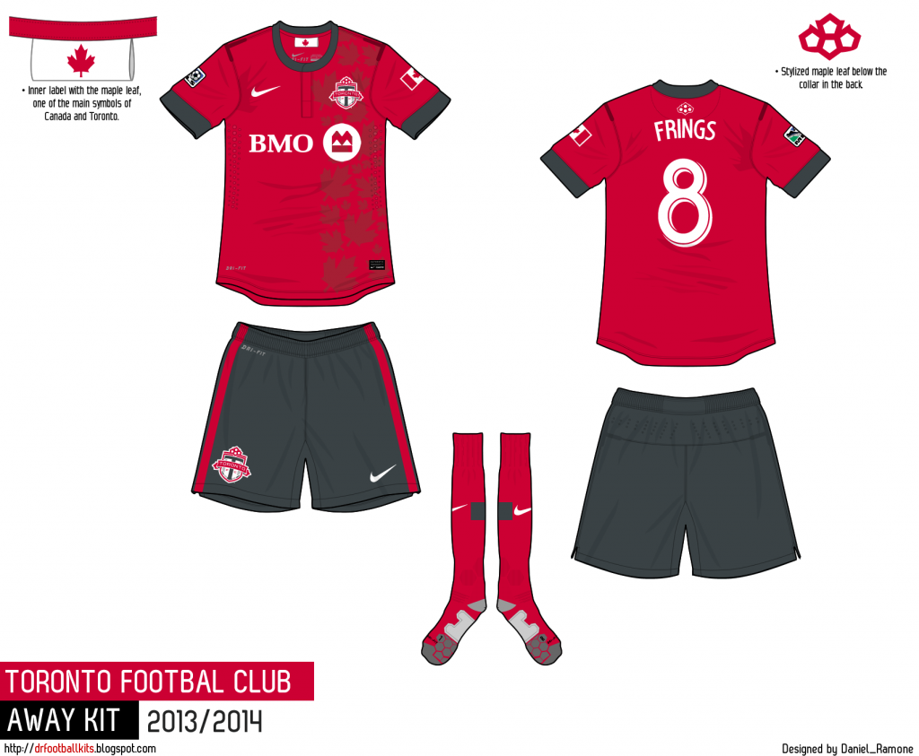
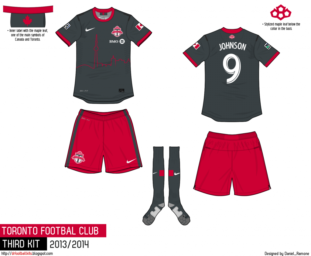
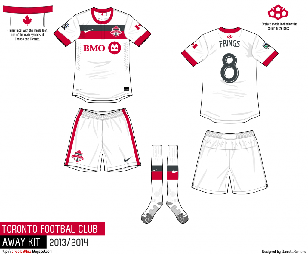
Some TFC Nike jersey concepts from a Sportslogos.net forum member. It's a shame we're stuck with the Adidas shoulder stripes for the foreseeable future, really limits what's possible with jersey design.

Those are really nice.
Toronto FC baby...best team everrrrrrrrrr -Jozy

Agreed very sharp.
I would buy TFC kits every year if they looked that good. Adidias stripes makes them less different year to year, thus less desire to remain current.
Yeah, I've still only got kits from the first season.
Toronto FC baby...best team everrrrrrrrrr -Jozy
Wow, those are unbelievably nice. Have to say the mock-ups you regularly see on websites are usually nicer than what ends up being the final product.

Great great stories behind this club....actually part of the reason the KW United FC supporters group was named Forsyth's Machine
ive got the year after. im a sucker for the collar.

Those are great - I love the single line city scape - just brilliant - although i'd prefer the grey a bit more charcoal grey, almost black in all kits.
Can't stand the Away but that Home and Third kit are better than anything current, maybe ever.
Personally I love the flag of Toronto and think the contrast would look sharp as a patch.

Don't like the red shirt.
Not a fan of the maple leaves.
Lacks creativity and strong composition.
Dark top with skyline is alright.
But I don't see BMO being ok with such a small logo.
White jersey is fine.
Simple bold design (more of a classic feel)

We agree.

Those are so f-ing sweet.... I would buy the black one fo sho.
 Posting Permissions

.jpg)


 Reply With Quote

.jpg)