Hell yeahOriginally Posted by __wowza


Hell yeah

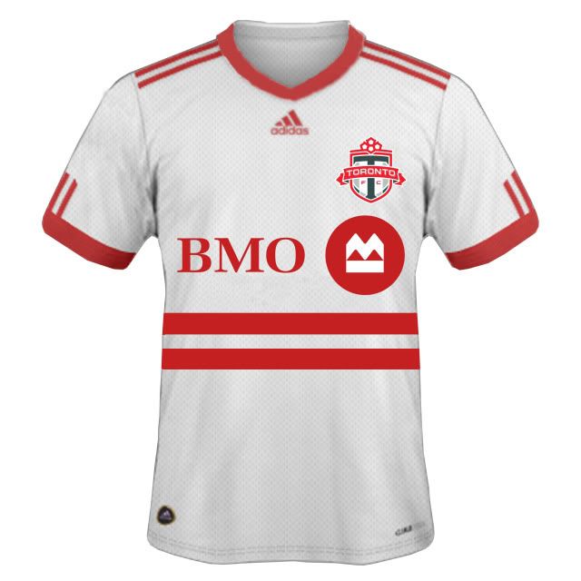
PAUL! Get this image over to the graphics boys at Adidas ASAP.
You're welcome.
Did the USA , of all countries, just fix soccer? - C. Ronaldo, May 27th commenting on the FBI-led investigations into fraud and corruption throughout FIFA.

Adidas has to have the three stripes on the shoulders.

So put 3 fucking stripes on the shoulders! doesn't ruin the integrity of the kit. I haven't bought a TFC kit since year 1, but I'd buy that in a nanosecond. I really don't like the weird lines and shadings on the sides of the kits we always have. It reminds of the hokey NLL jerseys. Just give me some solid crisp colours and a collar. Is that too much to ask?! 3 shoulder stripes or no
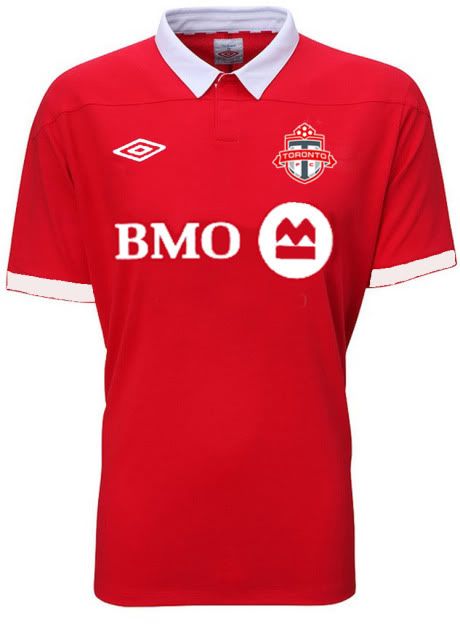
edit: I say that as the owner of a Toronto Rock jersey. So ya. Either way, how does this look professional? http://i.ebayimg.com/16/!B7dwYZQ!mk~...kI4rg~~_35.JPG
True true. Throw them up!
Did the USA , of all countries, just fix soccer? - C. Ronaldo, May 27th commenting on the FBI-led investigations into fraud and corruption throughout FIFA.

I love the black...red is nice too

That's why I love it. I have an old '73 United jersey that looks like this.
I just took the current Nottingham Forrest kit and replaced the badge and sponsor and added white trim on the sleeve.

Not so much TFC/MLS, there missing some unneccessary pipping, and added colours underneath the arms, neck, knees, and toes.....
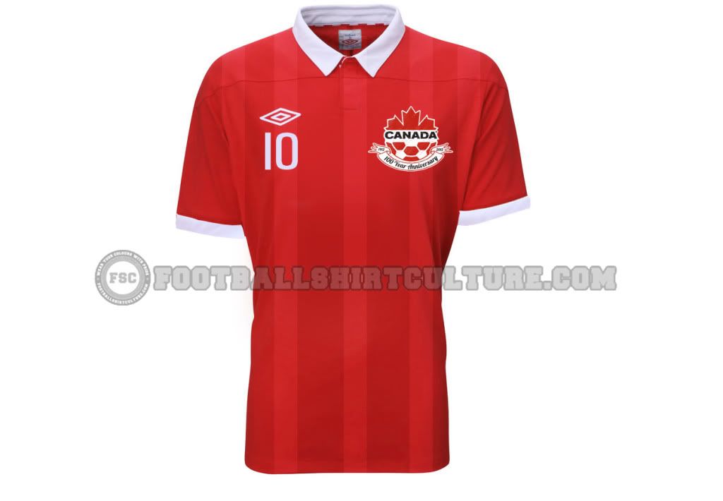
however...i would get this kit in an instant if this was Canada's jersey,
Last edited by Shway; 12-03-2011 at 01:02 AM.
that looks nice. The logo looks a little awkward but it has the the white trim on the arms that the Forrest kit didn't have. If that's real I'd definitely buy it.
Here is an away one I did using a Sevilla kit and ripping off this year's west ham away.
They need to hire you yesterday. I've seen a lot of mocked up TFC jerseys over the years, but this and the red one are easilly my 2 favorites. Hands down. Great work

and their logo, not umbro's

PORTLAND 3RD CONFIRMED
NEW ENGLAND HOME AND AWAY CONFIRMED
That Portland third kit looks amazing

apparently it's a retro kit from their 70s team
Years have gone by and Ive finally learned to accept myself for who I am: a beggar for good football.
I go about the world, hand outstretched, and in the stadiums I plead: A pretty move, for the love of God.
And when good football happens, I give thanks for the miracle and I dont give a damn which team or country performs it.
-Eduardo Galeano

^ why is it presented in what looks to be a gift box with what looks to be a folded scarf to one side... is that for Season ticket holders ?
::jealous::
a ha ha heh he hoo.. ha
from what ive read, the MLS is the first time they've had an adidas kit in 30 years. still a testament that adidas and a team can produce awesome work if they wanted to. i would've liked to see a retro adidas logo on there though, they did it with a lot of the track stuff they did for the world cup in korea/japan, i'm the proud owner of a boss nippon track jacket.
it's the kinda stuff that i'd see my dad wearing in old photos and would fucking LOVE to own if he still had it, so thats definitely something that's getting passed down to my youngins. also digging the retro alaskan airlines logo.

It's a limited edition, small, numbered production run of 2,012 only. Collectible item, not a SSH premium. $175.
IMO one of the nicest MLS kits adidas has done and PTFC makes it a limited, crazy.
the gift box set is limited, the replica kit isn't.
Oh, ok. That makes more sense.


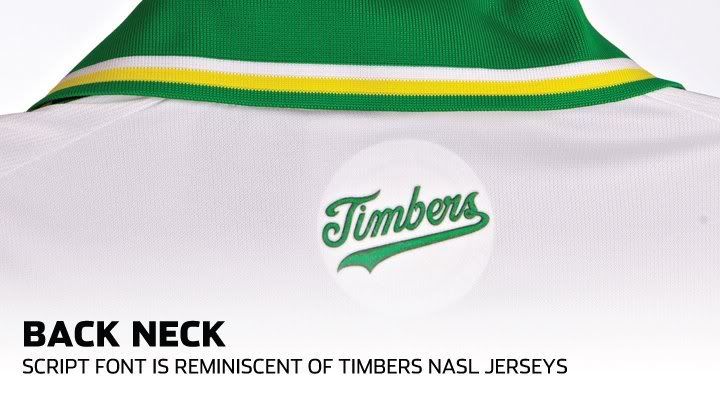
This was on the back neck:
Which is what they used to wear on the front of their old NASL uniforms:
Portland really knows how to make cool kits.
TORONTO FC, 2017 MLS CHAMPIONS!!! (Still the greatest in league history!)
And on the back of New England's new unis:
The patch on the back neck is the flag of New England.

TORONTO FC, 2017 MLS CHAMPIONS!!! (Still the greatest in league history!)

Shit, you guys have come up with some amazing jerseys! Why can't adidas?
That New England one is complete garbage. It's almost like a visual representation of the new era for NE under Heaps!
I'd really like to know if PTFC is just super insistent on getting what they want from adidas or other teams are just not asking for much in the way of kit design.

that New England flag is hilarious... a little tree in a white box and the rest is red. Genius!
Screw all the piping and crap, I love this jersey too! Simple, crisp looking, classy. A nice kit doesn't need to have wavey lines or piping or shading or weird lines under the armpit. It just needs to be simple and classic.
we need to riot over this already.
god i hate those stripes as much as I hate 15 dollar beers.
 Posting Permissions


 Reply With Quote