Page 1 of 10 12345 ... LastLast
Results 1 to 30 of 272
  1. #1
    Registered User
    Join Date
    May 2009
    Location
    scarborough
    Posts
    6,156
    Mentioned
    2 Post(s)
    Tagged
    0 Thread(s)

    Default MLS kit watch: 2012

    whose due for new kits this season:

    Dallas - New Home / Away
    LA - Home
    RBNY - Home
    Chivas - Home
    DCU - Home/Away (Revealed)
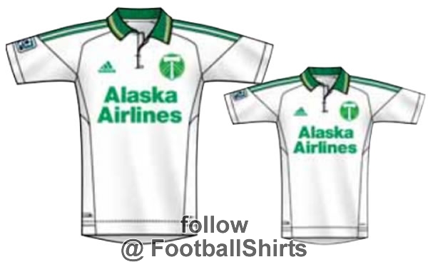
    Portland - 3rd - (Revealed)
    Sounders - 3rd (Revealed)
    Phila - Home/Away (Revealed)
    Chicago - Home/Away
    Montreal - Home/Away (Revealed)
    Columbus - Home/Away (Revealed)
    New England - Home/Away (Revealed)

    Toronto - Away/Third?


    UNION CONFIRMED

    weird that they've gone with a second blue that's not in their crest. it wouldn't look good with the colour palette they have already, but meh. they've gotten rid of the "naked" away kits, they only wore them once in the league this year after bringing in their white 3rd kit. makes sense, it works better with the sponsor. added note, they also now officially have 4 shades of blue in their away kit!


    SEATTLE 3RD CONFIRMED
    (now with 20% more beer gut and 100% of your daily intake of "OH GOD MY RETINAS!"


    DC UNITED CONFIRMED
    now with 50% more assurance that they're staying in DC? i was really hoping theyd bring back the three stripes but they did a palette swap of the great britain kit. aways are ugly, homes are probably the best kits in the league. DC has never done wrong with the home kit in my books.


    COLUMBUS CREW CONFIRMED
    jesus christ. anyone need a towel/apron? they aways look like a throwback to their first aways, but that doesn't stop them from being the ugliest thing ever.


    PORTLAND RUMOURED 3RD
    apparently this is for cup competitions, they were getting flack for not having a lighter option in their arsenal. expect this with green shorts that they can mix with their home kits like their first unveil.


    MONTREAL SNEAK PEEK
    fleur-de-lis? i know, i'm just as shocked as you are. hopefully they keep the pink aways, if anyone could pull it off, it'd be montreal. im all about teams establishing identities in the league, DC united rock black, chivas has the stripes, dallas has the hoops and im fucking sick of white aways.


    Last edited by __wowza; 12-08-2011 at 10:22 AM. Reason: updated

  2. #2
    Registered User
    Join Date
    May 2008
    Location
    Section 119
    Posts
    11,698
    Mentioned
    0 Post(s)
    Tagged
    0 Thread(s)

    Default

    Philly's new kit is very sharp. Conversely, Columbus now has the worst kit to match the worst logo in MLS.

  3. #3
    Moderator
    Join Date
    May 2008
    Location
    at the end of the longest line.
    Posts
    8,010
    Mentioned
    1 Post(s)
    Tagged
    0 Thread(s)

    Default

    isn't the DC - White jersey pretty similar to the new TFC Supporters kit?
    is it the same template?

  4. #4
    Registered User
    Join Date
    May 2008
    Location
    The Pub.
    Posts
    8,928
    Mentioned
    0 Post(s)
    Tagged
    0 Thread(s)

    Default

    Love the DC black kit... Really like the White one, just hate collars on kits (personal thing, I know a lot of people like them)...

    Columbus 1/2 "we ran out of colour dye kit" is just STUPID!
    "...Money wasn't tight, but it like, it wasn't right..."


  5. #5
    Registered
    Join Date
    Dec 2009
    Location
    Brantford
    Posts
    211
    Mentioned
    0 Post(s)
    Tagged
    0 Thread(s)

    Default

    The sad thing is some one actually got paid to design that awful Columbus away shirt. I thought it was a joke ther first time I saw it.

    I wouldn't mind if TFC had a black third kit similar to DC's! Its really sharp!

  6. #6
    Registered User
    Join Date
    May 2008
    Location
    The Pub.
    Posts
    8,928
    Mentioned
    0 Post(s)
    Tagged
    0 Thread(s)

    Default

    Quote Originally Posted by BS1327 View Post
    The sad thing is some one actually got paid to design that awful Columbus away shirt. I thought it was a joke ther first time I saw it.

    I wouldn't mind if TFC had a black third kit similar to DC's! Its really sharp!
    I want to meet the person who designed it, and selection committee that approved it and ask "...do you honestly believe that looks good? Really? Really?..." lol
    "...Money wasn't tight, but it like, it wasn't right..."


  7. #7
    Registered User
    Join Date
    May 2009
    Location
    scarborough
    Posts
    6,156
    Mentioned
    2 Post(s)
    Tagged
    0 Thread(s)

    Default

    the columbus away kit should have

    that way whores can enjoy the kit too!

  8. #8
    Registered User
    Join Date
    Jul 2008
    Posts
    2,882
    Mentioned
    0 Post(s)
    Tagged
    0 Thread(s)

    Default

    I like Philly's new jersey. I think it's quite sharp. Seattle started the league with a stylish bang as both of their first jerseys were awesome but everything since has been fugly.

  9. #9
    Registered User
    Join Date
    May 2008
    Location
    Toronto
    Posts
    2,706
    Mentioned
    0 Post(s)
    Tagged
    0 Thread(s)

    Default

    Quote Originally Posted by __wowza View Post
    the columbus away kit should have

    that way whores can enjoy the kit too!

    LOL. Would be a smart move on their part considering 65% of their fan base is part of the Skankius Nastius species.

  10. #10
    Registered User
    Join Date
    May 2008
    Posts
    1,156
    Mentioned
    0 Post(s)
    Tagged
    0 Thread(s)

    Default

    and does anyone have the pic of the new TFC supporters kit?

  11. #11
    Moderator
    Join Date
    May 2008
    Location
    at the end of the longest line.
    Posts
    8,010
    Mentioned
    1 Post(s)
    Tagged
    0 Thread(s)

    Default

    over/under on the number of retail sales of the Krew away jersey?

    9.5?

    probably a few rabid collectors?
    visually impaired fans?

  12. #12
    RPB Member
    Join Date
    Jul 2008
    Location
    Toronto - Upper Beaches
    Posts
    3,389
    Mentioned
    0 Post(s)
    Tagged
    0 Thread(s)

    Default

    Quote Originally Posted by Wagner View Post
    isn't the DC - White jersey pretty similar to the new TFC Supporters kit?
    is it the same template?
    I think it looks a lot better than the TFC supporter's kit.

  13. #13
    RPB Member
    Past-President

    Join Date
    May 2008
    Location
    112 - RPB
    Posts
    12,909
    Mentioned
    3 Post(s)
    Tagged
    0 Thread(s)

    Default

    The new Philly kit is nice, glad to see the Gold dumped.

    The seattle one looks aweful as does the Columbus one. Ugly kits can be fun but the Columbus one lookes unispired and lazy. Suits Columbus.

  14. #14
    RPB Member
    Join Date
    Nov 2008
    Location
    Toronto
    Posts
    1,080
    Mentioned
    0 Post(s)
    Tagged
    0 Thread(s)

    Default

    The Columbus one is aweful! Looks like they could only afford to Pay Adidas for 1/3 of the design.


    RoadTrips:Columbus/Vancouver/Montreal/Columbus/NewYork/Montreal/
    RPBScarf:2015/2019/2023

  15. #15
    RPB Member
    Moderator

    Join Date
    May 2008
    Location
    On the Interwebs
    Posts
    18,711
    Mentioned
    0 Post(s)
    Tagged
    0 Thread(s)

    Default

    Love that DC kit. That's the best one of theirs, yet.

    Anyone else notice that the Krew chose to have two lilly-white models (a cheerleader and a player?) to pose in their kit? No surprise there...
    Last edited by Oldtimer; 11-28-2011 at 02:05 PM.
    MLS is a tough, physical league, that emphasizes speed, and features plastic fields, grueling travel, extreme weather, and incompetent refs. - NK Toronto

  16. #16
    Registered User
    Join Date
    Jul 2008
    Location
    Wellington
    Posts
    2,421
    Mentioned
    0 Post(s)
    Tagged
    0 Thread(s)

    Default

    If that Crew jersey was a full jersey I think it'd look pretty good. As is it might be the most ridiculous kit in the league


    How does Seattle CONTINUE to have horrible 3rd Jerseys? They're one of the most supported clubs in the country, get a decent freaking design and colour scheme already.

  17. #17
    Registered User
    Join Date
    Sep 2011
    Location
    Hamilton, Ontario
    Posts
    61
    Mentioned
    0 Post(s)
    Tagged
    0 Thread(s)

    Default

    I don't think I've ever seen such an ugly jersey in my entire life... What is wrong with Seattle?

  18. #18
    Registered User
    Join Date
    May 2008
    Location
    West Hill
    Posts
    1,128
    Mentioned
    0 Post(s)
    Tagged
    0 Thread(s)

    Default

    love the DC United kit...very sharp!

  19. #19
    Registered User
    Join Date
    May 2009
    Location
    scarborough
    Posts
    6,156
    Mentioned
    2 Post(s)
    Tagged
    0 Thread(s)

    Default

    SEATTLE SOUNDERS 3RD KIT RELEASE PARTY
    RPB exclusive photo!!


    everyone in attendance got a kit coupon and two tabs of MDMA
    Last edited by __wowza; 11-28-2011 at 04:04 PM.

  20. #20
    Registered User
    Join Date
    May 2008
    Location
    The Pub.
    Posts
    8,928
    Mentioned
    0 Post(s)
    Tagged
    0 Thread(s)

    Default

    Quote Originally Posted by PearceCFC View Post
    I don't think I've ever seen such an ugly jersey in my entire life... What is wrong with Seattle?
    If you think Seattle is bad, scroll down to the Crew - it trumps it as its only "1/3 a kit"... LOL!
    "...Money wasn't tight, but it like, it wasn't right..."


  21. #21
    Registered User
    Join Date
    May 2008
    Location
    Edmonton
    Posts
    16,888
    Mentioned
    0 Post(s)
    Tagged
    0 Thread(s)

    Default

    Quote Originally Posted by BS1327 View Post
    The sad thing is some one actually got paid to design that awful Columbus away shirt. I thought it was a joke ther first time I saw it.

    I wouldn't mind if TFC had a black third kit similar to DC's! Its really sharp!
    Looks like Columbus's budget ran out just above the nipples.

  22. #22
    Registered User
    Join Date
    May 2008
    Location
    The jolly, candy-like button.
    Posts
    2,074
    Mentioned
    0 Post(s)
    Tagged
    0 Thread(s)

    Default

    So I wasn't paying attention and assumed they were teasing on the second crew shirt, that they'd release the rest of it later. That thing is real? Holy balls.

  23. #23
    Banned
    Join Date
    Mar 2009
    Posts
    68
    Mentioned
    0 Post(s)
    Tagged
    0 Thread(s)

    Default

    I never understood stood why more teams don't go with purple.
    It's a very complimentary colour to turf and grass's natural green.

    As far as Toronto's third jersey goes, I hope they stray away from the
    primary colours and do something completely different. BMO Blue perhaps.

    Also, this may be wishful thinking, but if TFC ever do decide to make
    a majour change in their kits, I'll be hoping for a red & yellow combination.
    Look at teams like Lens (France) or Watford (England). This combo works,
    and as far as I know, no MLS team has tried it. It also ties in to the Toronto
    Transit Commission colour scheme. To me, red & white seem so 'plain jane'.

    Perhaps a name change could also be in the cards.....Toronto Red Rockets
    You know, keep a bit of the old but also hint at a new direction.

    P.S. I'm still kinda ticked off this club doesn't call itself the 007's
    Last edited by no1redsfan; 11-29-2011 at 10:55 PM.

  24. #24
    Registered User
    Join Date
    Jul 2008
    Location
    Wellington
    Posts
    2,421
    Mentioned
    0 Post(s)
    Tagged
    0 Thread(s)

    Default

    Quote Originally Posted by __wowza View Post
    SEATTLE SOUNDERS 3RD KIT RELEASE PARTY
    RPB exclusive photo!!


    everyone in attendance got a kit coupon and two tabs of MDMA

    I got blue spots in my eyes from looking at this pic

  25. #25
    Registered User
    Join Date
    Jul 2008
    Location
    Wellington
    Posts
    2,421
    Mentioned
    0 Post(s)
    Tagged
    0 Thread(s)

    Default

    Quote Originally Posted by Razor View Post
    love the DC United kit...very sharp!
    Big plus 1. Classy, simple.

  26. #26
    Registered User
    Join Date
    May 2008
    Location
    Toronto - Annex
    Posts
    10,227
    Mentioned
    0 Post(s)
    Tagged
    0 Thread(s)

    Default

    Quote Originally Posted by __wowza View Post
    whose due for new kits this season:
    [FONT=Trebuchet MS]


    vertical stripes? check
    centered logo? check
    blue, white, and gold? check


  27. #27
    Registered User
    Join Date
    May 2009
    Location
    scarborough
    Posts
    6,156
    Mentioned
    2 Post(s)
    Tagged
    0 Thread(s)

    Default

    RED BULL HOME (RUMOURED)
    there's really not a whole lot you can do with stuff like this, ya know? white and red, the logo somehow got bigger. old chelsea template, etc. whatthefuckever.


    Last edited by __wowza; 12-01-2011 at 03:09 PM.

  28. #28
    RPB Member
    Join Date
    Jun 2009
    Location
    www.RedNationOnline.ca
    Posts
    4,011
    Mentioned
    0 Post(s)
    Tagged
    0 Thread(s)

    Default


  29. #29
    RPB Member
    Join Date
    Jul 2008
    Location
    Toronto - Upper Beaches
    Posts
    3,389
    Mentioned
    0 Post(s)
    Tagged
    0 Thread(s)

    Default

    That, I like.

  30. #30
    Registered User
    Join Date
    May 2008
    Location
    Toronto
    Posts
    2,706
    Mentioned
    0 Post(s)
    Tagged
    0 Thread(s)

    Default

    [quote=__wowza;1410327]


    Man at right (to himeslf): "I have absolutely ZERO chance of hooking up with this blonde looking like this."


Posting Permissions

  • You may not post new threads
  • You may not post replies
  • You may not post attachments
  • You may not edit your posts
  •