Page 1 of 3 123 LastLast
Results 1 to 30 of 62
  1. #1
    Registered User
    Join Date
    May 2009
    Location
    scarborough
    Posts
    6,156
    Mentioned
    2 Post(s)
    Tagged
    0 Thread(s)

    Default next years TFC kits

    this IS NOT a thread that contains any pictures or descriptions of our next kit (although i'm sure that it's going to get several hits based off of that). i also know i'm jumping the gun on next year talk when this season isn't finished.

    i was just wondering, MLS teams update their kits every two seasons and next season is our turn i believe, if anyone knew or had heard anything in regards to what we can expect. adidas tends to have generic templates of kits available for the year (minus colour schemes, etc) when the EPL and la liga start up, so i'm guessing it would be one of those?

    correct me if i'm wrong on any of this.

  2. #2
    Registered User
    Join Date
    May 2008
    Location
    East of Vancouver
    Posts
    4,010
    Mentioned
    0 Post(s)
    Tagged
    0 Thread(s)

    Default

    I'd think it'll be something close to the white kit.

  3. #3
    Registered User
    Join Date
    May 2008
    Posts
    504
    Mentioned
    0 Post(s)
    Tagged
    0 Thread(s)

    Default

    Here's Adidas 10/11 teamwear catalogue.
    I'm sure it'll be something boring from these pages: http://issuu.com/misobb/docs/catalog...wear_2010-2011

  4. #4
    RPB Member
    Join Date
    Jun 2009
    Location
    www.RedNationOnline.ca
    Posts
    4,011
    Mentioned
    0 Post(s)
    Tagged
    0 Thread(s)

    Default


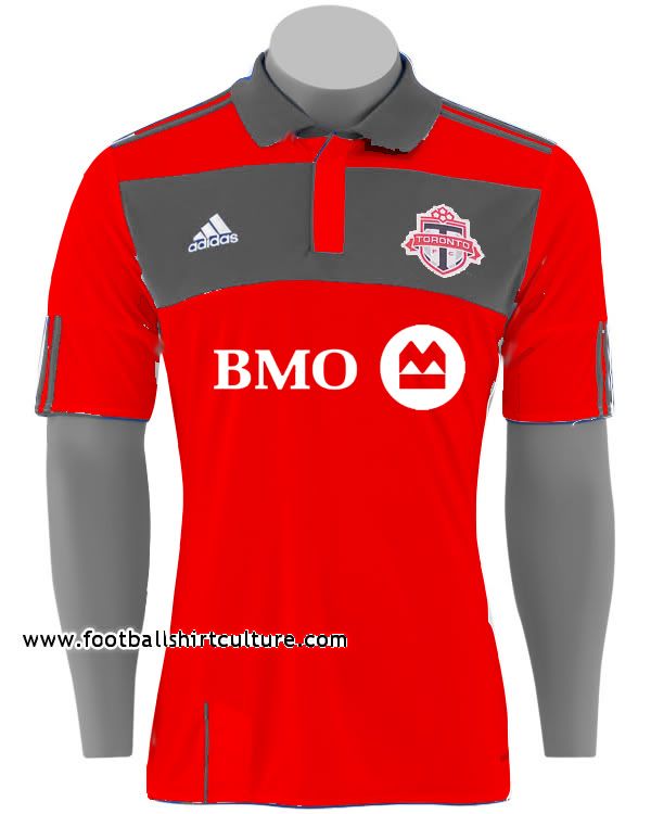
    Using Chelsea 2011 as the template

  5. #5
    Registered User
    Join Date
    May 2009
    Location
    scarborough
    Posts
    6,156
    Mentioned
    2 Post(s)
    Tagged
    0 Thread(s)

    Default

    Quote Originally Posted by arbogast View Post
    Here's Adidas 10/11 teamwear catalogue.
    I'm sure it'll be something boring from these pages: http://issuu.com/misobb/docs/catalog...wear_2010-2011
    ugh! abrogast, make these less shit!

  6. #6
    Registered User
    Join Date
    May 2008
    Location
    The Pub.
    Posts
    8,928
    Mentioned
    0 Post(s)
    Tagged
    0 Thread(s)

    Default

    Quote Originally Posted by JimmyBaldX View Post


    Using Chelsea 2011 as the template
    I like that - alot...

    Simple, no collar, a classy red jersey...

    At the end of the day, any jersey they come out with, some will love it, some will hate, some will be indifferent...

    There is one thing I am 10000% certain about - I'm not buying a new kit every 2-years, so I'll be "retro" in the stands for a while...

    Carts...
    "...Money wasn't tight, but it like, it wasn't right..."


  7. #7
    Registered
    Join Date
    Mar 2009
    Location
    parkdale
    Posts
    2,993
    Mentioned
    0 Post(s)
    Tagged
    0 Thread(s)

    Default

    Quote Originally Posted by JimmyBaldX View Post


    Using Chelsea 2011 as the template
    I really like that. as long as they didn't put any extra crap like all for one or an embossed maple leaf on it, i would be seriously tempted to buy that, even with the big bmo ad.

  8. #8
    Registered User
    Join Date
    May 2009
    Location
    scarborough
    Posts
    6,156
    Mentioned
    2 Post(s)
    Tagged
    0 Thread(s)

    Default

    Quote Originally Posted by Darlofletch View Post
    even with the big bmo ad.
    i'm sorely against having both the logo AND the company name on ANY jersey. this isn't me right? i'd love to have just the logo on ours.

  9. #9
    Registered User
    Join Date
    May 2009
    Location
    scarborough
    Posts
    6,156
    Mentioned
    2 Post(s)
    Tagged
    0 Thread(s)

    Default

    Quote Originally Posted by JimmyBaldX View Post
    Using Chelsea 2011 as the template
    what with the shoe horn and all?


  10. #10
    Registered User
    Join Date
    May 2008
    Location
    The Pub.
    Posts
    8,928
    Mentioned
    0 Post(s)
    Tagged
    0 Thread(s)

    Default

    Quote Originally Posted by __wowza View Post
    i'm sorely against having both the logo AND the company name on ANY jersey. this isn't me right? i'd love to have just the logo on ours.
    I've been watching footy so long, that when I see a jersey without a sponsor it looks weird...

    I know that is horrible to say - its just the truth...

    I will say this, a footy jersey has never made me change or purchase from a company...

    I'm a TFC supporter - I bank at TD Bank...

    I'm a Liverpool supporter - I drink Coors Light (I know Carlsberg is now gone)...

    Advertising only works if you let it...

    Carts...
    "...Money wasn't tight, but it like, it wasn't right..."


  11. #11
    Registered User
    Join Date
    May 2009
    Location
    scarborough
    Posts
    6,156
    Mentioned
    2 Post(s)
    Tagged
    0 Thread(s)

    Default

    Quote Originally Posted by McCartney View Post
    I've been watching footy so long, that when I see a jersey without a sponsor it looks weird...
    i meant BMO logo


    on our kit it wouldn't necessarily be that bad. i'm just an asshole when it comes to aesthetics and having that + the company name throws off every kit ive ever seen.

  12. #12
    Registered User
    Join Date
    May 2008
    Location
    The Pub.
    Posts
    8,928
    Mentioned
    0 Post(s)
    Tagged
    0 Thread(s)

    Default

    Quote Originally Posted by __wowza View Post
    i meant BMO logo


    on our kit it wouldn't necessarily be that bad. i'm just an asshole when it comes to aesthetics and having that + the company name throws off every kit ive ever seen.
    You're right about the current look of the TFC kit. The BMO logo is too big, or too high/close to the TFC crest...

    A logo like this (BMO) where the left side of the logo is so pronounced, its tough for it to look good with a team crest above it...

    On the new kit, they need to either shrink the BMO logo, or take it down a touch - it just doesn't look "right" in its current format...

    Carts...
    "...Money wasn't tight, but it like, it wasn't right..."


  13. #13
    Registered
    Join Date
    Mar 2009
    Location
    parkdale
    Posts
    2,993
    Mentioned
    0 Post(s)
    Tagged
    0 Thread(s)

    Default

    Just get rid of it all together.

    paul beirne I hereby promise to buy any and every kit tfc ever puts out that doesn't have a sponsor.

    that's got to be better than bmo's $4m a year right?

  14. #14
    Registered User
    Join Date
    May 2009
    Location
    scarborough
    Posts
    6,156
    Mentioned
    2 Post(s)
    Tagged
    0 Thread(s)

    Default

    forgive the crude mockup, i think that looks a fuck ton better though.


    and i agree with the whole "scrapping of the sponsor" idea, after seeing what they did to my beloved spurs kit although might i add that this will never happen in the MLS.
    Last edited by __wowza; 09-20-2010 at 04:09 PM.

  15. #15
    Registered User
    Join Date
    Apr 2010
    Location
    Whitby Ontario
    Posts
    1,629
    Mentioned
    0 Post(s)
    Tagged
    0 Thread(s)

    Default

    I dont like just the logo on the jersey at all... Especially the mock-up above. Looks weird to me. I think it would look a lot better if it just said 'BMO' on it.
    Last edited by razor787; 09-20-2010 at 04:26 PM.

  16. #16
    Registered
    Join Date
    Nov 2008
    Posts
    6,451
    Mentioned
    1 Post(s)
    Tagged
    1 Thread(s)

    Default

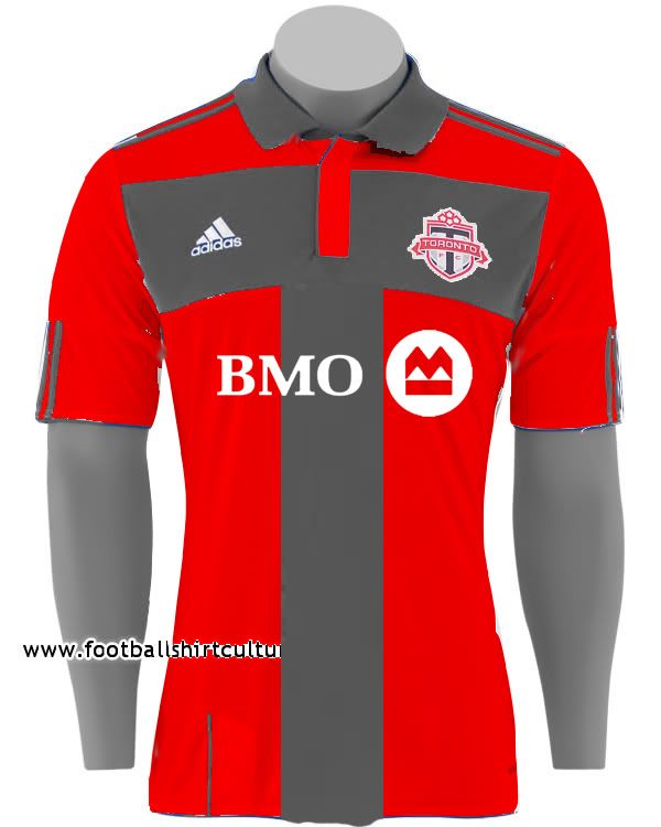
    ^ looks a little like the "Green Lantern"


    Jimmy you did up a very rough design based on Chelsea's away kit last year.

    A little arranging and Photoshoping out the blue and I think you've got a winner:


  17. #17
    Registered User
    Join Date
    May 2009
    Location
    scarborough
    Posts
    6,156
    Mentioned
    2 Post(s)
    Tagged
    0 Thread(s)

    Default

    like this? i'm going to be doing up a few in class tonight (what the hell else would i be doing in a lecture?). i just don't have photoshop at work.


  18. #18
    Registered User
    Join Date
    May 2008
    Posts
    76
    Mentioned
    0 Post(s)
    Tagged
    0 Thread(s)

    Default

    I've seen the template for the new jerseys.. IMO they are hideous... its a red body with dark grey sleeves... i didn't like it at all.....

  19. #19
    Registered User
    Join Date
    May 2008
    Location
    Bloor Islington Etobicoke
    Posts
    507
    Mentioned
    0 Post(s)
    Tagged
    0 Thread(s)

    Default

    Quote Originally Posted by joshpa View Post
    I've seen the template for the new jerseys.. IMO they are hideous... its a red body with dark grey sleeves... i didn't like it at all.....
    Ugh! Let's just lose the grey already, it's such a downer of a colour.

  20. #20
    RPB Member XI17 Moderator
    Join Date
    May 2008
    Location
    Oshawa, Ontario
    Posts
    8,510
    Mentioned
    0 Post(s)
    Tagged
    0 Thread(s)

    Default

    Quote Originally Posted by JimmyBaldX View Post


    Using Chelsea 2011 as the template
    First words out of my mouth: "Yep. That works for me."

    I gotta admit, there's always something classy about going minimalistic. Reverse red/white for the away top and make a black or dark grey third jersey and we are set!
    Did the USA , of all countries, just fix soccer? - C. Ronaldo, May 27th commenting on the FBI-led investigations into fraud and corruption throughout FIFA.

  21. #21
    Registered User
    Join Date
    May 2008
    Posts
    1,198
    Mentioned
    0 Post(s)
    Tagged
    0 Thread(s)

    Default

    From what I was told the jersey will look very similar to this year just replace the grey and change it to black. They will be keeping the white kit and the third jersey will be all black.

    This info was given to me from a friend who orders TFC product from Adidas

  22. #22
    Registered User
    Join Date
    May 2009
    Location
    scarborough
    Posts
    6,156
    Mentioned
    2 Post(s)
    Tagged
    0 Thread(s)

    Default

    i can do with a black third, im not a fan of the grey we got at the moment.

  23. #23
    RPB Member
    Join Date
    Jun 2009
    Location
    www.RedNationOnline.ca
    Posts
    4,011
    Mentioned
    0 Post(s)
    Tagged
    0 Thread(s)

    Default

    Quote Originally Posted by Pookie View Post

    Jimmy you did up a very rough design based on Chelsea's away kit last year.

    A little arranging and Photoshoping out the blue and I think you've got a winner:

    Hey I remember this one!

    So, __wowza's red shirt (which I love btw, great retouching), the white for away and this gray style as third?

  24. #24
    RPB Member
    Join Date
    Jun 2009
    Location
    www.RedNationOnline.ca
    Posts
    4,011
    Mentioned
    0 Post(s)
    Tagged
    0 Thread(s)

    Default


    Alright, how are these?

  25. #25
    Registered User
    Join Date
    May 2008
    Posts
    1,144
    Mentioned
    0 Post(s)
    Tagged
    0 Thread(s)

    Default

    i may or may not have seen it...but the red kit might look very similar to what we have not, minus the collar, darker grey on the sleeves with 2 embossed maple leafs in the background...just sayin'

  26. #26
    RPB Member
    Join Date
    Jun 2009
    Location
    www.RedNationOnline.ca
    Posts
    4,011
    Mentioned
    0 Post(s)
    Tagged
    0 Thread(s)

    Default

    Quote Originally Posted by icecoldbeer View Post
    i may or may not have seen it...but the red kit might look very similar to what we have not, minus the collar, darker grey on the sleeves with 2 embossed maple leafs in the background...just sayin'
    Ugh it was tacky enough with the one maple leaf

    (My very first facepalm! )

  27. #27
    Registered User
    Join Date
    May 2008
    Posts
    1,144
    Mentioned
    0 Post(s)
    Tagged
    0 Thread(s)

    Default

    Quote Originally Posted by JimmyBaldX View Post
    Ugh it was tacky enough with the one maple leaf

    (My very first facepalm! )
    On paper it looks ok, we will have to see what it looks like in flesh. I did like your mock ups though!

  28. #28
    Registered User
    Join Date
    Dec 2008
    Location
    Ajax
    Posts
    2,050
    Mentioned
    0 Post(s)
    Tagged
    0 Thread(s)

    Default


  29. #29
    Registered User
    Join Date
    May 2008
    Location
    westdale, hamilton
    Posts
    6,436
    Mentioned
    0 Post(s)
    Tagged
    0 Thread(s)

    Default

    I love this one


    I'm not a fan of any there one

  30. #30
    RPB Member
    Join Date
    Jun 2009
    Location
    www.RedNationOnline.ca
    Posts
    4,011
    Mentioned
    0 Post(s)
    Tagged
    0 Thread(s)

    Default

    Quote Originally Posted by nascarguy View Post
    I love this one


    I'm not a fan of any there one
    I don't know if you're making fun of my poor photoshopping skills back in the day or you're being serious


Posting Permissions

  • You may not post new threads
  • You may not post replies
  • You may not post attachments
  • You may not edit your posts
  •