The logo's fine, I'll find something else about the team to not like.


The logo's fine, I'll find something else about the team to not like.

their supporters..their ground their team, Evil Bert? the list goes on like this.Originally Posted by Eastend

M.U.F.C.U.M GAMBA OSAKA Toronto FC

Oh I agree in general, but in this case I think that if Vancouver's new logo had a shield encompassing the design, it would be more attractive. I find it too simplistic as it is...

You know, I can't find it in me to hate the Whitecaps.
Evil Bert doesn't hold a candle to Evil Bill (Archer).
MLS is a tough, physical league, that emphasizes speed, and features plastic fields, grueling travel, extreme weather, and incompetent refs. - NK Toronto

it's not as bad as some in MLS.... but come on, this is what you come up with?
I had forgotten about Mr Archer.
I didn't care about the whitecraps or their supporters till I read their board and some of their supporter comments on youtube.
M.U.F.C.U.M GAMBA OSAKA Toronto FC

I agree. They had sooooo much hitstory to draw from. Elements from the 86ers, Royals, NASL Caps could have been involved.
It looks like there was an argument over some of the design elements and a compromise was done to make everyone happy.
The basic rule for design I have is if I can do it...it's not a good design. I could have done this.
It's like they took the German Football Federation logo:
And married it with Wonder Woman:
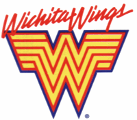
Or the Wichita Wings:
My thoughts on the Whitecaps new logo.
http://vancouver.theoffside.com/team-news/whitecaps-unveil-new-logo-first-thoughts.html#comments
Reminds me of this:

This may have been better:


you got a problem wit waves?
while I don't really like the new logo, I think the colour scheme will work out well for them. 3-tone blue? That could totally work.
///\\\///\\\///\\\///\\\///\\\///\\\///\\\///\\\
I didn't like it at first, but now I do. Simplicity is a good thing when it comes to logo design, not to mention all the elements crammed into this seemingly simple design....the mountain reflected in the ocean, the use of the v and w. I want to see how it looks on the jersey.

Is this to represent from 'sea to sky'?

The logo's not bad and represents the mountains, V in vancouver and W in whitecaps...
but really... what does it have to DO with a whitecap OR whitecaps?
I think the logo is quite nice. Well done. Looking forward to having another Canadian team in the MLS.
The whitecap refers to the year round snow on the mountains.
The last logo had nothing to do with whitecaps, this logo tries to tie the logo to the team name
I've seen a similar shape somewhere in the depths of FIFA 08. I like it quite a lot, very unique, no soccer balls, maple leafs or crappy effects rearing their ugly heads.
I thought a whitecap was the white top of a cresting wave?
That's why they have the mountains reflected in the ocean... they hit both definitions with one clever logo. The more you think about it the better it gets, really.
My mind just exploded!

I checked out some of the merch they are selling on their site. I can see this looking good on a jersey. I like it, definite improvement.
this would have been a much better logo


hmmm i like it. Its simple, perfect for Vancouver supporters.

Completely agree.
If "they" like it I guess that is all that matters.

I actually think the problem is the colours. Dark blue, like blue and white. There's not enough contrast. They should have had the lettering be in black or dark green or something. That's what it really needs.
Is anyone able to photoshop up something like that?

I like the new crest, but I don't care for the font used in it. Perhaps the font from the old Whitecaps emblem could have been incorporated into the new one. ^

I...just don't know. It's just hard to say, seems a bit slapped together.
Still possibly the only known RPB to appear on Masterchef Canada.
(I think?)
The one they have now feels cartoony, this one just feels so...
Either way, none of the two logos work for them and both of them just look...meh.
Still possibly the only known RPB to appear on Masterchef Canada.
(I think?)

I like it. Its simple and classy. No stupid soccer ball in the logo which I really appreciate. Also very different from every other crest. I think its well done.
 Posting Permissions


 Reply With Quote