Page 3 of 4 FirstFirst 1234 LastLast
Results 61 to 90 of 106
  1. #61
    Registered User
    Join Date
    Jul 2008
    Posts
    23,374
    Mentioned
    0 Post(s)
    Tagged
    0 Thread(s)

    Default

    Quote Originally Posted by Super Cereal View Post
    Glad I'm not the only one...

    Did you read my post? They share at least 4 main themes, characteristics.

  2. #62
    RPB Member
    Past President

    Join Date
    May 2008
    Posts
    5,065
    Mentioned
    0 Post(s)
    Tagged
    0 Thread(s)

    Default

    It's almost a good logo.

    I hate the cheesy old soccer ball with the black spots. And the maple leaf looks really out of place.

    The 4 colour shield is pretty cool though and I like the colour. Hopefully they have four square jersey's.

  3. #63
    Registered User
    Join Date
    May 2008
    Location
    Section 114... News Flash: Flatpicker doesn't listen to everything he reads!
    Posts
    13,040
    Mentioned
    0 Post(s)
    Tagged
    0 Thread(s)

    Default

    ^ putting aside the bad photoshop fx for a moment, it would be cool if their jerseys have a quarter design.

    I've always been a fan of that look.

    Bristol Rovers have that design on their shirts and in their crest.

    http://www.bristolrovers.co.uk/javaI...3367224,00.jpg

  4. #64
    Registered User
    Join Date
    Jul 2008
    Posts
    2,882
    Mentioned
    0 Post(s)
    Tagged
    0 Thread(s)

    Default

    That logo... is shit.

  5. #65
    RPB Member XI17 Moderator
    Join Date
    May 2008
    Location
    Oshawa, Ontario
    Posts
    8,510
    Mentioned
    0 Post(s)
    Tagged
    0 Thread(s)

    Default


    Pretty uninspiring if you ask me. I don't mind the colours, and the shield itself is pretty sweet, but they could have done a LOT better, especially when you consider how good the Edmonton City Coat of Arms is or the Flag of Alberta.
    Did the USA , of all countries, just fix soccer? - C. Ronaldo, May 27th commenting on the FBI-led investigations into fraud and corruption throughout FIFA.

  6. #66
    Registered
    Join Date
    May 2008
    Location
    Brampton Ont.
    Posts
    54,992
    Mentioned
    0 Post(s)
    Tagged
    0 Thread(s)

    Default

    Imitation highest form of flattery etc etc LOL even if that imitation is poorly.
    M.U.F.C.U.M GAMBA OSAKA Toronto FC


  7. #67
    Registered User
    Join Date
    May 2008
    Location
    Section 114... News Flash: Flatpicker doesn't listen to everything he reads!
    Posts
    13,040
    Mentioned
    0 Post(s)
    Tagged
    0 Thread(s)

    Default

    I'm really surprised they approved it they way it is.

    If they simply removed some of the unnecessary f/x, it would look so much better.

    Simple is better... and this is a good example of an idea taken too far.

  8. #68
    Registered
    Join Date
    May 2008
    Location
    Brampton Ont.
    Posts
    54,992
    Mentioned
    0 Post(s)
    Tagged
    0 Thread(s)

    Default

    I know LOL why is there a bevel Emboss on a logo meant for a sports team LOL. The clip art is also amusing.
    M.U.F.C.U.M GAMBA OSAKA Toronto FC


  9. #69
    Registered User
    Join Date
    Aug 2008
    Posts
    770
    Mentioned
    0 Post(s)
    Tagged
    0 Thread(s)

    Default

    Quote Originally Posted by jloome View Post
    Quick question to the people who dislike it: what doesn't work? Colour issues? Shape? Wording/content?

    Just curious. The more analytical the better. Ditto for anyone who likes it.
    First reaction definitely is all the effects on it, beveling, stroke on the Edmonton. Not sure about the colour choice, would have to see why the designer chose it. To me, there's nothing unique about this, it just looks like a very generic soccer logo with nothing in it that really says "Edmonton".

    Which is too bad because another USSF team, St. Louis, clearly invested in their identity and IMO is really strong.

    Last edited by spark; 04-20-2010 at 09:10 PM.

  10. #70
    Registered User
    Join Date
    Aug 2008
    Posts
    2,582
    Mentioned
    0 Post(s)
    Tagged
    0 Thread(s)

    Default

    I can see some problems with the FC Edmonton Logo, especially if they start calling the team "The FC" Edmonton.

  11. #71
    Registered
    Join Date
    May 2008
    Posts
    30,364
    Mentioned
    0 Post(s)
    Tagged
    1 Thread(s)

    Default

    The St. Louis logo is quality.

  12. #72
    RPB Member
    Join Date
    May 2008
    Location
    Bringin' Scarborough to The Beach!
    Posts
    4,968
    Mentioned
    1 Post(s)
    Tagged
    0 Thread(s)

    Default

    Quote Originally Posted by spark View Post

    Which is too bad because another USSF team, St. Louis, clearly invested in their identity and IMO is really strong.


    that is a nice logo! - the first of the three

  13. #73
    Registered User
    Join Date
    May 2008
    Location
    Out of my brain on the 5:15
    Posts
    8,865
    Mentioned
    0 Post(s)
    Tagged
    0 Thread(s)

    Default

    Quote Originally Posted by Whoopee View Post
    Really?

    Do we think we're that self important?
    TFC invented self-importance.

  14. #74
    Registered User
    Join Date
    Jul 2008
    Posts
    23,374
    Mentioned
    0 Post(s)
    Tagged
    0 Thread(s)

    Default

    I like the STL logo as well. The colours not so much but the emblem is original.

  15. #75
    Registered User
    Join Date
    May 2008
    Location
    westdale, hamilton
    Posts
    6,436
    Mentioned
    0 Post(s)
    Tagged
    0 Thread(s)

    Default

    Quote Originally Posted by canadian_bhoy View Post
    It's almost a good logo.

    I hate the cheesy old soccer ball with the black spots. And the maple leaf looks really out of place.

    The 4 colour shield is pretty cool though and I like the colour. Hopefully they have four square jersey's.
    yeah I like the shield part it's not a bad looking logo the old one sucks ass

  16. #76
    Registered User
    Join Date
    May 2008
    Location
    westdale, hamilton
    Posts
    6,436
    Mentioned
    0 Post(s)
    Tagged
    0 Thread(s)

    Default

    Quote Originally Posted by spark View Post
    First reaction definitely is all the effects on it, beveling, stroke on the Edmonton. Not sure about the colour choice, would have to see why the designer chose it. To me, there's nothing unique about this, it just looks like a very generic soccer logo with nothing in it that really says "Edmonton".

    Which is too bad because another USSF team, St. Louis, clearly invested in their identity and IMO is really strong.

    ewww wtf is that shit?

  17. #77
    Registered
    Join Date
    May 2008
    Location
    CALGARY.
    Posts
    6,140
    Mentioned
    0 Post(s)
    Tagged
    0 Thread(s)

    Default

    Quote Originally Posted by nascarguy View Post
    ewww wtf is that shit?
    It's a fleur de lys, or a version of it. It's also part of the logo for St. Louis Athletica in the WPS.

    St. Louis (and Missouri in general) was part of the Louisiana Purchase -- hence the French themes.
    Still possibly the only known RPB to appear on Masterchef Canada.
    (I think?)

  18. #78
    Registered
    Join Date
    May 2008
    Location
    CALGARY.
    Posts
    6,140
    Mentioned
    0 Post(s)
    Tagged
    0 Thread(s)

    Default

    Quote Originally Posted by Smokecell View Post


    I've seen this somewhere...hmmm
    Oh Edmonton...

    First the "Rush", now this...
    Still possibly the only known RPB to appear on Masterchef Canada.
    (I think?)

  19. #79
    Awaiting Confirmation
    Join Date
    Jul 2008
    Location
    Vancouver
    Posts
    6,417
    Mentioned
    0 Post(s)
    Tagged
    0 Thread(s)

    Default

    That STL logo is really impressive. Very, very classy. Edmonton's looks like a cartoon, I can't take it seriously. It's really just unspeakably bad.

  20. #80
    Awaiting Confirmation
    Join Date
    Jul 2008
    Location
    Vancouver
    Posts
    6,417
    Mentioned
    0 Post(s)
    Tagged
    0 Thread(s)

    Default

    Quote Originally Posted by twistedchinaman View Post
    St. Louis (and Missouri in general) was part of the Louisiana Purchase -- hence the French themes.
    Missouri in general, and I'd say quite a bit more: http://en.wikipedia.org/wiki/File:Un...04-1804-03.png

    Jefferson was ready to pay $10 million for the port of New Orleans, and ended up paying $15 million for one third of the current United States. Well played, Napoleon.

  21. #81
    Registered User
    Join Date
    May 2008
    Posts
    120
    Mentioned
    0 Post(s)
    Tagged
    0 Thread(s)

    Default

    curse edmonton for using a heraldic shield for an emblem! everyone knows TFC did it first, how unoriginal can those fuckshits get?? rawr!!
    Last edited by volunteer; 04-21-2010 at 01:26 AM.

  22. #82
    Registered User
    Join Date
    May 2008
    Location
    Markham
    Posts
    327
    Mentioned
    0 Post(s)
    Tagged
    0 Thread(s)

    Default

    Whats with the fucking ball going into logos? Its so god damn childish, we know its a fucking soccer team you don't need to show the ball in the logo.

  23. #83
    Registered User
    Join Date
    May 2008
    Posts
    120
    Mentioned
    0 Post(s)
    Tagged
    0 Thread(s)

    Default

    Quote Originally Posted by Mojo View Post
    Whats with the fucking ball going into logos? Its so god damn childish, we know its a fucking soccer team you don't need to show the ball in the logo.
    fuck those assholes for wanting to distinguish themselves from other sports!

  24. #84
    Registered User
    Join Date
    May 2008
    Location
    prime8contra.com
    Posts
    959
    Mentioned
    0 Post(s)
    Tagged
    0 Thread(s)

    Default

    Now I know why I dislike this one so much. It's too much like another bad logo, from Toronto!

    Black, Blue, and Beveled!!!


  25. #85
    Registered User
    Join Date
    May 2008
    Location
    Section 114... News Flash: Flatpicker doesn't listen to everything he reads!
    Posts
    13,040
    Mentioned
    0 Post(s)
    Tagged
    0 Thread(s)

    Default

    ^ and I hate that logo too!

    Why did the Jays change a good thing?

  26. #86
    Registered User
    Join Date
    May 2008
    Location
    prime8contra.com
    Posts
    959
    Mentioned
    0 Post(s)
    Tagged
    0 Thread(s)

    Default

    As much as I love my Jays, I will NEVER fully back them until they go back to this:


    Anyone living in or near Toronto knows how popular this logo is. It's on almost every ball cap you see.

    What blew me away a month ago was to see how many stores were carrying hats with this same logo, in places like Queen's and Brooklyn. Seriously, next to Yankee caps, the old school Blue Jays were the most popular logo out there.

    Anyone who thinks a logo is not important, needs to reassess...

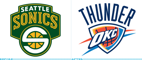
    I'm a FORMER SuperSonics fan. Not only because the team moved, but because they did THIS!!!!!!!

  27. #87
    RPB Member
    Join Date
    Jul 2008
    Location
    Fort Kickass!
    Posts
    5,423
    Mentioned
    0 Post(s)
    Tagged
    0 Thread(s)

    Default

    Quote Originally Posted by spark View Post
    First reaction definitely is all the effects on it, beveling, stroke on the Edmonton. Not sure about the colour choice, would have to see why the designer chose it. To me, there's nothing unique about this, it just looks like a very generic soccer logo with nothing in it that really says "Edmonton".

    Which is too bad because another USSF team, St. Louis, clearly invested in their identity and IMO is really strong.

    The middle one's ok. I know the green shield is based on the Gateway Arch, but it looks like the sole of a shoe. The two outer ones give the impression of a stalk of corn.

    Personally, I wished the group had gone with their original logo when they were trying to join MLS:

    TORONTO FC, 2017 MLS CHAMPIONS!!! (Still the greatest in league history!)

  28. #88
    Registered
    Join Date
    May 2008
    Posts
    30,364
    Mentioned
    0 Post(s)
    Tagged
    1 Thread(s)

    Default

    Either way, both are still better than Edmonton's.

  29. #89
    RPB Member
    Join Date
    Jul 2008
    Location
    Fort Kickass!
    Posts
    5,423
    Mentioned
    0 Post(s)
    Tagged
    0 Thread(s)

    Default

    ^^ Agreed!
    TORONTO FC, 2017 MLS CHAMPIONS!!! (Still the greatest in league history!)

  30. #90
    Registered User
    Join Date
    Jul 2009
    Posts
    1,428
    Mentioned
    0 Post(s)
    Tagged
    0 Thread(s)

    Default

    https://docs.google.com/leaf?id=0B3s...YzBiNmI0&hl=en\

    I was bored so I came up with this logo which I'd like to see instead. Simple, same basic style but doesn't have any extra crap.


Posting Permissions

  • You may not post new threads
  • You may not post replies
  • You may not post attachments
  • You may not edit your posts
  •