Page 4 of 4 FirstFirst 1234
Results 91 to 106 of 106
  1. #91
    Registered User
    Join Date
    Jul 2009
    Posts
    1,437
    Mentioned
    0 Post(s)
    Tagged
    0 Thread(s)

    Default

    It takes the aspects from the coat of arms which actually represent the city. As for the FC part, it could either be placed in the sun or within the top two black/blue squares.

    I figure if I can do this with paint of all things, Edmonton could get someone to come in and create a much better logo than what they have.

  2. #92
    Registered User
    Join Date
    Jul 2008
    Location
    Waterloo
    Posts
    102
    Mentioned
    0 Post(s)
    Tagged
    0 Thread(s)

    Default

    Quote Originally Posted by RealG-TFC View Post
    they could have used those wings in Edmonton's CofA

    That is one badass coat of arms!

  3. #93
    Registered User
    Join Date
    May 2008
    Posts
    2,523
    Mentioned
    0 Post(s)
    Tagged
    0 Thread(s)

    Default

    Quote Originally Posted by Yeoman View Post
    see i kind of like that too.
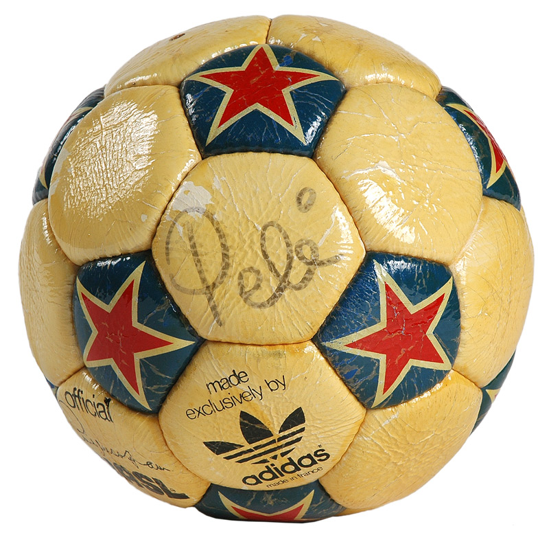
    though the soccer ball is a bit lame *shrug*
    That ball was the official ball of the NASL so it was kind of natural for them to include it.


  4. #94
    Registered User
    Join Date
    May 2008
    Posts
    2,523
    Mentioned
    0 Post(s)
    Tagged
    0 Thread(s)

    Default

    Quote Originally Posted by spark View Post
    First reaction definitely is all the effects on it, beveling, stroke on the Edmonton. Not sure about the colour choice, would have to see why the designer chose it. To me, there's nothing unique about this, it just looks like a very generic soccer logo with nothing in it that really says "Edmonton".

    Which is too bad because another USSF team, St. Louis, clearly invested in their identity and IMO is really strong.

    The middle is the safe pick as you can at least ensure your lettering isn't going to get lost in the background colour (whatever that colour may turn out to be).

    The gold lettering in 1 and 3 needs some sort of contrast factor ie a drop shadow or a hairline.

  5. #95
    Registered User
    Join Date
    Aug 2008
    Posts
    770
    Mentioned
    0 Post(s)
    Tagged
    0 Thread(s)

    Default

    If you check out the logos against white, it works better than the grey here on the post.

    Not to mention - go to the AC St. Louis site or Flikr and see their kits. The entire logo rolls out really well across all mediums.

    The FC Edmonton might look 'ok' standing alone and on the home page of the website, but did they think how it will look on their kits? Or TShirts? Or even better, flags and banners? How many variations have you seen with the TFC logo on Flags and Banners - what will we see in Edmonton? A big blue and black flag with a 70s clipart soccer ball in the middle? A giant beveled "FC"? Wooo!

  6. #96
    RPB Member XI17 Moderator
    Join Date
    May 2008
    Location
    Oshawa, Ontario
    Posts
    8,510
    Mentioned
    0 Post(s)
    Tagged
    0 Thread(s)

    Default

    Quote Originally Posted by spark View Post
    First reaction definitely is all the effects on it, beveling, stroke on the Edmonton. Not sure about the colour choice, would have to see why the designer chose it. To me, there's nothing unique about this, it just looks like a very generic soccer logo with nothing in it that really says "Edmonton".

    Which is too bad because another USSF team, St. Louis, clearly invested in their identity and IMO is really strong.

    Fuck, AC St. Louis?

    Gotta say I like the last two designs. Too much going on with the gold star and full city name on the first one.

    Gets 4/5 from me. The name itself gets a big fat donut.
    Did the USA , of all countries, just fix soccer? - C. Ronaldo, May 27th commenting on the FBI-led investigations into fraud and corruption throughout FIFA.

  7. #97
    Registered
    Join Date
    May 2008
    Location
    Kettering, OH
    Posts
    2,473
    Mentioned
    0 Post(s)
    Tagged
    0 Thread(s)

    Default

    Quote Originally Posted by Cannon View Post
    That is one badass coat of arms!

    Meh, it's okay.
    I would definitely use some of the elements from it to make a logo.
    The banner overhead would have been better than what they are using, and around the pioneers waist...there's your clubs colours...copper and blue not to mention it's a perfect design for their first scarf.
    The scepter behind the crest is intreaging. I would have worked that in somehow.

  8. #98
    Registered
    Join Date
    May 2008
    Location
    low earth orbit
    Posts
    5,517
    Mentioned
    2 Post(s)
    Tagged
    1 Thread(s)

    Default

    I like it when footy teams add the ball to their badges - so it's not confusing for the fans. Baseball teams do that a lot as well. Birds sitting on bats and things like that.

    a ha ha heh he hoo.. ha

  9. #99
    Registered User
    Join Date
    May 2008
    Posts
    3,331
    Mentioned
    0 Post(s)
    Tagged
    0 Thread(s)

    Default

    Edmonton logo isnt that bad, i mean it could be worse and look like the White Caps logo or San Jose Earthquakes or Kansas City Wizards, i mean now those are pure shit logos, hell crap names to. But THe Edmonton Crest looks really easy, like you could make that by copy and pasting different soccer crests and put them all in 1 in and could make it all in about 5 mins.

    WHy is it that the old teams knew how to make really good logos, the best logos in Basball, Hockey, Basketball, and Football often the old skool ones, it aint just soccer where teams today got shit logos, look at the old hockey logos compared to the many shitty hockey logos today. Teams like the Red Wings, Blackhawks, even logos easy like the Boston Bruins showed class. Much better then the new Avalance, Thrashers, Wild and Blue Jackets.

  10. #100
    Registered
    Join Date
    May 2008
    Location
    Brampton
    Posts
    271
    Mentioned
    0 Post(s)
    Tagged
    0 Thread(s)

    Default

    As bad as the FC Edmonton logo may be, I still have to admit that it's better than half of the crests used by the CSL. Not the White Eagles though, that one is badass. And have you seen their website? Awesome.


  11. #101
    RPB Member
    Join Date
    Jul 2008
    Location
    Fort Kickass!
    Posts
    5,423
    Mentioned
    0 Post(s)
    Tagged
    0 Thread(s)

    Default

    While I'm not crazy about FC Edmonton's logo, I did manage to create a kit set inspired by it.

    Main kit:


    Change kit:


    Whatcha think?
    TORONTO FC, 2017 MLS CHAMPIONS!!! (Still the greatest in league history!)

  12. #102
    Registered User
    Join Date
    May 2008
    Posts
    3,454
    Mentioned
    0 Post(s)
    Tagged
    0 Thread(s)

    Default

    Quote Originally Posted by Mark83 View Post
    As bad as the FC Edmonton logo may be, I still have to admit that it's better than half of the crests used by the CSL. Not the White Eagles though, that one is badass. And have you seen their website? Awesome.
    Just had a look, and its easily the best team crest I've seen so far in North America,

    ...IMHO

  13. #103
    Registered User
    Join Date
    May 2008
    Location
    Section 114... News Flash: Flatpicker doesn't listen to everything he reads!
    Posts
    13,042
    Mentioned
    0 Post(s)
    Tagged
    0 Thread(s)

    Default

    So Edmonton is using the quarters design on their jersey?... I like that!
    Still can't stand their logo unfortunately.

  14. #104
    RPB Member
    Join Date
    Jun 2008
    Location
    Sec. 112
    Posts
    2,517
    Mentioned
    0 Post(s)
    Tagged
    0 Thread(s)

    Default

    Quote Originally Posted by flatpicker View Post
    So Edmonton is using the quarters design on their jersey?... I like that!
    Still can't stand their logo unfortunately.
    It's his own fan rendering, not their real kit. I do like it tho.

  15. #105
    Registered User
    Join Date
    May 2008
    Location
    Toronto
    Posts
    2,706
    Mentioned
    0 Post(s)
    Tagged
    0 Thread(s)

    Default

    Quote Originally Posted by Redcoe15 View Post
    While I'm not crazy about FC Edmonton's logo, I did manage to create a kit set inspired by it.

    Main kit:


    Whatcha think?

    How dare they use #9.

  16. #106
    RPB Member XI17 Moderator
    Join Date
    May 2008
    Location
    Oshawa, Ontario
    Posts
    8,510
    Mentioned
    0 Post(s)
    Tagged
    0 Thread(s)

    Default

    Quote Originally Posted by Redcoe15 View Post
    While I'm not crazy about FC Edmonton's logo, I did manage to create a kit set inspired by it.

    Main kit:


    Change kit:


    Whatcha think?
    I think that checkerboard almost always works.
    Did the USA , of all countries, just fix soccer? - C. Ronaldo, May 27th commenting on the FBI-led investigations into fraud and corruption throughout FIFA.


Posting Permissions

  • You may not post new threads
  • You may not post replies
  • You may not post attachments
  • You may not edit your posts
  •