So do you like them and will you buy one?


Its a wicked Jersey!!
Ah its ok
The same dam thing!
Different and alittle overkill


So do you like them and will you buy one?

Short sleeve one looks pretty good. The long sleeve one... I don't know.
I'm glad they got rid of the squiggly lines.
- Scott
Heroism breaks its heart, and idealism its back, on the intransigence of the credulous and the mediocre, manipulated by the cynical and the corrupt. ~Christopher Hitchens

i'm not all that into it.
it's nice.
but i guess i was expecting something more.

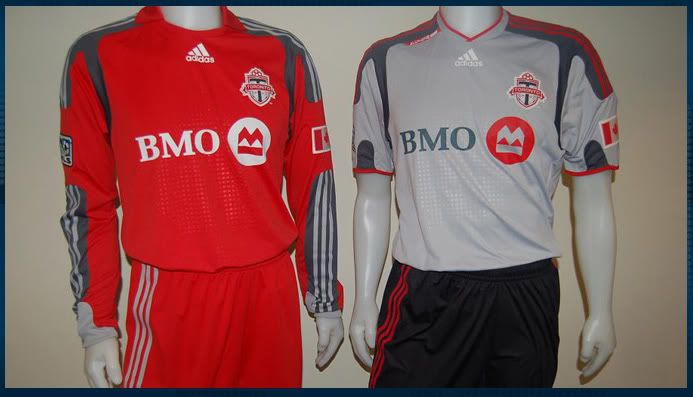
Squiggles gone = great!
Collar on red shirt = pretty good
New collar design on grey = good
Grey shoulders on red top = bad
Breaking up grey strip on arms of red top = really bad
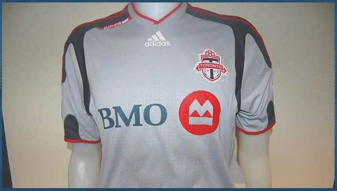
Grey shoulders on grey top = pretty cool (much better than the previous grey kit)
Canadian flag on shoulders = not bad... not totally necessary, but fine
"All for One" on collar = nice idea... TFC crest font would have been better though.
Size of BMO logo = not so good... crowds the TFC crest... shrink that sponsor!
My score:
Red Jersey = 6.5/10 - a step sideways from the last one... replaced one flawed design with another.
Grey Jersey = 7.5/10 - a nice step up from the last one... Shockingly, it looks better than the red now!
I won't be buying the red one this year... I will stick with the one I have.
But this may be the year I pick up a grey top.... but $119.99?????
That's robbery!
oh... and I really like the black shorts with the grey top!
Last edited by flatpicker; 12-04-2008 at 09:18 PM.

I agree with everything you just said. Don't under estimate the fine red pipe collar on the grey though.Originally Posted by flatpicker

Its a small detail but it seems to pop againest the grey really nicely.
Last edited by Stryker; 12-04-2008 at 09:16 PM.
^ I mentioned that... I like it...

I want one, I really like it.
I got the feeling the players looked to be not overly immpressed with the 'new' kit.
Only the addition of the Canadian flag crest and embroidery seemed to catch their eye.
KD.

I think the grey looks better too -- although, I actually liked the old grey one better as well.
While the breaking up of the striping on the longsleeve looks bad, it's done for practical reasons -- so that the league or competition crest doesn't have to be sewn over the Adidas stripes (Look at the current Chelsea and Liverpool kits you'll see it's the same now).
The reason ours looks so bad with it is because of the large onyx band of colour beneath the stripes. Hideous.

Where is the picture of the "all for one" I can't find it anywhere
![[NBF]'s Avatar](image.php?s=c3840db1bc353385b457afc76b1dcea9&u=1574&dateline=1515553264 "[NBF]'s Avatar")
The stripes going down the armpit make it look like CFL jersey, all they need is shoulder pads. im pretty sure in the pic i saw rohan ricketts was pointing at the canadian flag and laughing his ass off. I voted for overkill,but when i see them on the field i will try to focus on the skill displayed on the field rather than complete trash of jerseys.

they look crappy.
Those jerseys look too much like dc united.

UUUUUGGGGGGGLLLLLYYYYYYY!!!!!!!!!!!
^ why isn't that an option, cuz that is what i would vote. wouldn't wear one if the gave them out on opening day!
now i understand y they wanted ppl to buy it b4 they could see it though.
TFC 2009 jersey sales going way down.
I just thought that they were really pushing the marketing around the colour RED. So it doesn't make much sense to me for them to move away from that and have really crappy dark grey detailing on the home shirt.
They really should have used the font from the TFC crest I think... but it's ok.
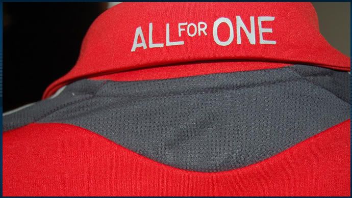
I agree, and I think it could have been a bit more subtle to be honest
Who is Scott Sutton??
http://www.thestar.com/Sports/article/548707
Toronto FC players Rohan Ricketts, left, and Scott Sutton, right, show off the new 2009 home and away uniforms during a press conference in Toronto December 4, 2008
This looks ok here... shame about the red one though.

My reaction was as follows...
Meh
Yeah, given that, really, it's a somewhat silly motto.


I think it's pretty ugly, to be honest. The only think I like is the black shorts. I won't be buying one.
Although maybe once we see the short-sleeve red one it will look better.
but will you buy the black shorts?
ummm... not so much...

I don't like the collar.
How come Sutton didn't show the goalkeeper jersey?
Although it is better.
Also -- any word on the crests? Felt or patch?
Can't wait to see the boys in the away kits with the black shorts for the first time...they are awesome
I echo the sentiments of others.
Meh.
I won't rush out to buy one. But if there is a sale on, then maybe I'll consider.
For the time being, no thanks.
Though I'm glad the crest is now sewn on.
 Posting Permissions


 Reply With Quote